Thread replies: 351
Thread images: 61
Thread images: 61
File: JUST.png (193KB, 265x370px)
193KB, 265x370px
JUST
>>
That's fake, right.
>>
>>52420396
You haven't heard anon?
>>
They don't even make me angry. Just depressed. Their existence is an embarrassment.
>>
>>52420396
It's not. It does looked better in person.
https://twitter.com/TrickMTG/status/846850855626145792
>>
File: FB_IMG_1490744405293.jpg (27KB, 265x370px) Image search:
[Google]

27KB, 265x370px
Fuck. I was in class on College and decided to check magicspoilers for any new spoiler. I had to leave the class because i was just so excited. Some of them look like ass, but fuck, Counterspell and Chain Lightning are beautiful! The best Masterpieces yet.
>>
File: Image (4).png (146KB, 223x311px) Image search:
[Google]
146KB, 223x311px
>>52420543
>Best Masterpiece yet
>>
>>52420093 >>52420543
>Artistic modifications also may not obstruct or change the mana cost or name of the card.
Not tournament legal, jackass.
>>
File: 250px-Carte_Promo_Mew_Antique.png (196KB, 250x352px) Image search:
[Google]
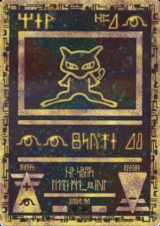
196KB, 250x352px
>yfw pokémon did a better job 15 years ago
>>
>>52420614
doesn't obstruct. obfuscate, maybe, but it's written in English you hmong.
>>
>>52420614
It's a legal card, not an artistic modification.
>>
>>52420093
>>52420543
They look like shit.
>>
>>52420652
It changes the name. The spell is chain lightning, but this printing presents the name as "[wingding character] [wingding character] [wingding character] chain lightning."
>>
>>52421498
well it's a good thing humans are better than robots at reading that shit.
... a good thing unless you're a robot and can't overcome it.
>>
>>52424859
/r9k/ is a perfectly respectable part of our sitealso, robots have gotten pretty good at reading that shit
>>
>not black or white border
>shouldn't be tournament legal
>wotc will change the comprehensive rules just to allow their horrific monstrosity of a cardframe to assault my eyes weekly.
>>
>>52421498
>Chair lightrirg
>>
I'm not going to lie, consecrated sphinx and mind twist look fucking legit and i'm going to play the shit out of them
>>
File: ATinZrwfSXsQOPPt7tZA_lowres.jpg (151KB, 1053x732px) Image search:
[Google]
151KB, 1053x732px
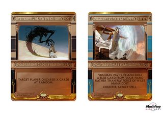
OH MY GOD
When they first announced the Masterpieces I didn't think much of it but both the lands in Zendikar and the artifacts in Kaladesh looked good and these are just... mindblowing. They are so great that I can barely comprehend it.
As someone who always preferred the pre-8th edition frames and never get completely used to the post-8th frame, these are the best-looking Magic cards Wizards has printed in over ten years.
Just the idea that these exist make me so happy that I'm grinning.
>>
File: mistake_magic.png (123KB, 537x416px) Image search:
[Google]
123KB, 537x416px
>>52425898
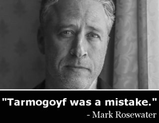
maro please
>>
>>52420543
You're obviously a shill, they're garbage, you're garbage, magic is fucking awful now
>>
>>52428942
To be fair, some of them nail that early magic feel pretty well,particularly mind twist. Most are unreadable garbage, but a few are on point.
>>
>>52425898
>IMINDTWISTI
>IFORCEOFWILLI
Really makes you think. Now you can counter spells with the Apple approved Force of your Willi.
>>
>>52428977
No, no they don't. Old magic had breathtaking, inspiring art, not some tablet garbage thrown together in 20 minutes on a computer.
Masterpieces are ruining magic.
>>
>>52429085
>Old magic had breathtaking, inspiring art, not some tablet garbage thrown together in 20 minutes on a computer.
there's good and shitty art in every mtg set. stop being such a faggot
>>
>>52429085
The irrational screeching of a pure hater. It's okay not to like things without the hyperbole.
>>
>>52420621
That looks as much like ass as these masterstains.
>>
I'm excited about pulling these because I won't feel bad immediately selling them to buy 2 to 4 copies of a normal version. Some of the Zendikar and Kaladesh ones I would be torn about doing the same.
Some of the art looks good but the borders are hideous.
>>
>>52420093
quite possibly the worst layout ever concieved. What's up with that shitty card name font? come on guys, there are better ways to show "Egyptian" stylistic font designs and make it readable.
Also is this the smallest non split card art ever?
>>
>>52429085
>Old magic had breathtaking, inspiring art,
>>
>>52420093
honestly the art is good for all the masterpieces i've seen the border is ugly as fuck.
>>
>>52429085
>Old magic had breathtaking, inspiring art,
>>
File: KOBOLDS_OF_KEK_KEEP.jpg (50KB, 582x467px) Image search:
[Google]

50KB, 582x467px
>>52429274
>>
>>52425898
igor the best mtg artist currently.
>>
>>52420093
WILD BEAT?
>>
File: WORD_OF_COMMIE_SQUINT.jpg (56KB, 500x409px) Image search:
[Google]
56KB, 500x409px
>>52429284
>>
>>52420543
Counterspell is the ugliest one.
>>
The only bearable invocations so far are Wrath of God and Mind Twist, mainly because the art is simplistic and doesn't fight for space with the border too much
Every single invocation that counters things looks like garbage
>>
>>52425667brb buying out wc deck card
>>
If they were full art with no rules text, or even if just the art was bigger, they would be better. Still cool tho fuck the h8trs lulz. I hope to buy them cheap of enough people hate them.
>>
These cards fucking suck and their creators should be fired.
>>
File: Mind Twist border.jpg (399KB, 1053x732px) Image search:
[Google]
399KB, 1053x732px
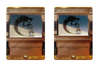
A few minutes in photoshop. How much better is it?
>>
>>52429544
It was MEANT to be a mistake, just like delver, snapcaster, jace, and splinter twin in standard with deciever. People love them! Its just a small vocal minority who dont now but will later, just watch!
t. (((Maro)))
>>
>>52429594
How much negative feedback can WOTC possibly ignore?
>>
>Loyal Retainers
I don't mind the crazy art
>>
>>52429417
Yell I'll just use my modern masters ones
>>
File: spell pierce.png (189KB, 265x370px) Image search:
[Google]

189KB, 265x370px
Shit, that Spell Pierce art is pretty sweet. The color contrasts. I don't mind getting this even though it's 'just' a common.
>>
File: snapshot.png (68KB, 619x396px) Image search:
[Google]
68KB, 619x396px
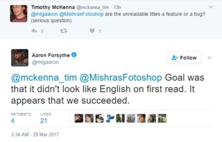
You don't get it, being unreadable garbage is a FEATURE
>>
>10 blue invocations
>0 green
welp
>>
>>52429757
Players love drawing cards! Players love blue! Players love EDH!
>>
>>52429743
Should've used that art for Force of Will
>>
>>52429743
The artwork on these is insulting. Using highly contrasting blue and orange to make them eyecatching instead of just making the art good is a cheap trick.
>>
>Everyone getting mad about cards they are never ever going to get in a pack.
wew lad
>>
>>52429920
Better yet
>Everyone getting mad about cards they secretly wished to get in a pack.
>>
>>52429920
That's what I thought as well, then I pulled a planar bridge and meekstone at the AER pre-release. You never know when rng is in play.
>>
>>52429744
>we're going to take those cards you wanted reprints of
>and make them super-mythic
>and also make them look fucking trash
>>
>>52429942
Better yet
>Everyone getting mad about cards they secretly preorder at the very first opportunity anyway.
>>
>>52429744
It's actually a feature when you take your head out of your ass and realize that the contrast of the incredibly different border along with the art and unreadable text makes you feel like you just discovered an ancient egyptian artifact when opening your booster pack.
It's the wild difference and strange looking formatting that makes these so interesting to look at, WotC attempted to do something different with the whole Egypt theme and i feel they did a great job, maybe the border is a bit too big but the idea was fucking amazing.
But hey. You guys want your generic uninteresting fullart premium foils that have been done for the course of the game a million times.
>>
>>52429287
That's not how you spell Terese Nielsen or Rebecca Guay.
>>
>>52429670
All of it, as usual.
People are all 100% agreeing, everywhere on the internet, that the frame, text, "heiroglyphs", and art shrinking are all complete shit on these, even straight to MaRo's face on his twitter, but he's ignoring it.
https://twitter.com/maro254/status/846879106574663680
http://markrosewater.tumblr.com/post/158953269553/did-you-anticipate-some-of-the-negative-criticisms
>>
>>52429987
>it's a feature that these don't even look like Magic the Gathering cards
>to both inexperienced and experienced players
>>
These look like shit!
>>
File: 1466170084474.jpg (9KB, 500x441px) Image search:
[Google]

9KB, 500x441px
>>52420494
>It's not. It does looked better in person.
Except it doesn't. If anything it looks worse.
>mfw I pull an Invocation Force of Will and am only able to sell it for $35 because they look like shit
>>
>>52430222
If that foil force of will is only worth 35 I'll commit suicide live in screen cause that will literally never happen
>>
File: IMG_0069.jpg (30KB, 292x257px) Image search:
[Google]

30KB, 292x257px
>People like Full Art Cards
>Let's print cards with more strange borders and less art
Why
>>
>>52429280
SHIEEEEEEEEEEET
>>
File: thinking intensifies.gif (458KB, 256x256px) Image search:
[Google]

458KB, 256x256px
>>52425898
>FORCE OF WILLI
>>
>>52430241
>If that foil force of will is only worth 35 I'll commit suicide live in screen cause that will literally never happen
I'm being slightly facetious, but honestly, the only people who these cards will appeal to are:
>autist collectors who have "pimp" decks but drive a '91 Camry
>people with no taste
I'm expecting for them to go for above EMA Force of Will prices but probably below the foil EMA Force of Will price
>>
>>52429594
Don't forget that the only reason Damnation got a pass in the first place was because JewWater continually shilled it would "sell the set" on it's own
>>
File: 1490477585752.png (543KB, 600x429px) Image search:
[Google]
543KB, 600x429px
>>52430252
>Guys, we're losing too much time and money on having to print these really different masterpiece cards
>I know, let's print the ugliest pieces of sin we can, then pull the old "completely misinterpret player feedback" shtick and say "oh, people didn't like masterpieces as a whole, so we're discontinuing them
>Brilliant!
I guarentee it.
>>
>>52429987
Look at the knob-gobbling YGO shitlord. Go the fuck back to school you piece of garbage. Good game design means READABLE content, with CLEAR, CONSISTENT DESIGNS. all these lolrandum generic card border alters are ruining Magic.
>>
>>52430299
One thing I noticed is a lot of the cards they are printing are Legacy staples. I think they can take it a step further and interpret
>Oh well we tried to get Legacy players to buy Standard packs but they didn't so fuck Legacy
>>
>>52429549
still shit
>>
>>52430317
You are speaking like these fucking cards are going to be in 1 out of 3 booster packs. Get the autism out of your asshole and realize that these are supposed to be extremely rare collector's edition cards.
If you open 6 Booster Boxes at most you will see maybe ONE or TWO of these cards, this shit isn't going to flood the fucking market, it's supposed to be special, you aren't going to walk into fnm after release and get eye cancer when your Timmy player pulls out his Legacy deck with a playset of Japanese Invocation Force of Wills.
>>
>>52430384
If you'd get MaRo's cock out of your mouth for one second, you'd realize that the consensus across the internet is 95% against and 5% in favor of these shit masterpieces, and that's being generous to those in favor.
Just about everyone everywhere agrees these are shit.
>>
File: mortify.jpg (63KB, 312x445px) Image search:
[Google]

63KB, 312x445px
>>52430384
just because they're rare doesn't mean they have to look shit
they can look different without being awful looking
the one thing they shouldn't fuck is the black borders. those are what make magic cards recognizable for me. mess around with anything else, just not the borders.
>>
Straw poll on opinions
http://www.strawpoll.me/12631235
>>
File: you fucking idiot.jpg (23KB, 500x377px) Image search:
[Google]

23KB, 500x377px
>>52430018
>I expect negative criticism about every thing we do. It’s the nature of the internet
Jesus, MaRo is so sad at this point that I honestly feel bad for the guy
>>
>>52430628
here is a poll i posted on 4chan yesterday 3 minutes after reveal
https://strawpoll.com/ybrdze9
it seems like both polls offer the same answer: lot of people dislike them, some love it, no one likes to give them an average score.
it looks like a lot of people who now thinks they are ugly would prefer to hold off their judgement until they see one IRL.
>>
>>52430692
how long until Wi$ards release a statement blaming the criticism of the masterpieces on "alt right 4chan anonymoyus gamergates"
>>
>>52430277
>Anywhere between the EXTREMELY narrow range of $70 to $370
No shit anon, these ugly fucking things are definitely going to be worth triple digits money. I'm just glad that if I open one I can sell it for a regular Force and some cash
>>
>>52429942
The difference this time is that I only want them for the money they'll fetch: not that I want a rare card with a unique design.
>>
They really do look a lot better in paper but making the names hard to read on purpose is beyond stupid
>>
>>52430692
do you feel bad for a guy who spend his life in a dream job that gains him millions and is pretty good at and loved for, when he just fucks up something?
he'll learn, he'll correct it or he just won't give a fuck and be just fine.
i would prefer to feel bad for the stakeholders and his higher ups who bet money on a company that was looking to boom up and instead is wasting resources and opportunities to do better due to the retardation of a dozen people at R&D.
>>
>>52420093
>>52420543
Those are so fucking hard to read.
>>
>>52430436
well considering he's a pathetic unpaid WOTC intern desperately trying to impress someone instead of getting coffee, its no wonder he's towing the party line like a good little brainwashed drone.
Masterpieces are garbage, MTG has been garbage since Innistrad
>>
>>52430785
I don't feel bad for the guy for succeeding, that's stupid.
I feel bad because this IS his dream job and he's trying what he feels is his best and it's come to the point that he just expects people to shit on his vision.
I mean, It's overall not a good vision, but I know I hate it when people shit on my dreams.Plus, being the voice of the company means that every time something goes wrong, everyone blames him, or at least bitches about it to him. That's gotta wear on the guy
>>
As someone who doesn't play magic, the cards are already a pain in the ass to interpret. Why bother notching up the difficulty?
>>
>>52420093
I think this shit looks ugly as all hell.
>>
Imma buy 4 FoW and slam them inmanaless dredge
>>
>>52429842
>Contrast is just a cheap trick to make weak art stronger
>>
>>52430946
go back to facebook games you disgusting faggot
>>
>>52430946
MtG, at least in the last 15 years, has the clearest and most functional card wording of all card games i know.
for almost all cards there is only one way to word them and only one way to interpret them.
There is indeed a large amount of keyworded abilities, but that happens in every game.
>>
>>52420093
>Doesnt look like a MTG card
>Color is shown with stripes
>Mana symbols not colored
>Hard to read CMC
>Hard to read card types
>Hard to read name
>A/D is set up weird
>Rules text is centered
>Artwork credit takes up a lot of space
>Legal words do not match the rest of the card
>Attempts a "3D perspective" effect but looks 2D as fuck in real life giving an extremely fake CGI feel to the card
Holy fuck man who approved this shit? The worst part is my last point Obvious CGI art is bad enough but the whole card screams early 90's CGI and it looks horrible.
>>
>>52430785
It's more than that, I think.
There's no way he doesn't know that Magic has only become more and more corporate, with decisions being made entirely to rake in a large audience and not to make a good game with an intriguing story. I would be surprised if he isn't a little sad that they have to pander to the tumblr market and make a story that's trying to shove a mockery of the superhero formula into a fantasy world.
And he has to defend all this. He gets hate and insults flung at him for things that weren't even his decision. For all we know any given point of contention he could have fought tooth and nail to NOT HAVE, and now he has to sit there as people tell him it's his fault that thing is ruining Magic, and then defend it using his polite doublespeak.
That's not to say he doesn't love his job and love interacting with the Magic community. His tumblr blog and his podcasts are both done completely on his own volition. But at the same time, you gotta have some respect for a man who serves as the hate sink for an entire team of people of which he only controls a fraction.
>>
>>52429920
Its more of most players realize they will likely get ONE masterpiece series draw in their life. They are mad because that one lucky draw could turn out to be one of these ugly pieces of shit.
>>
>be in bed with SJWs
>use tacky egypt font with random ass hieroglyphs to make it seem more """egyptian"""
JUST
>>
>>52431188
Maro is a hollow corporate shill who does whatever his paycheck tells him to. Stop idolizing filth you disgusting SJW assbag.
>>
>>52431098
>Doesnt look like a MTG card
it looks like one, it just happen to also look like a yugiho one.Technically all unique border cards are bound to not look like a mtg card.
>Color is shown with stripes
and? you can still point it out easily since it's the only color in the borders
>Mana symbols not colored
but they are perfectly understandable and they look sculpted in stone. fortuantely they didn't print any card with complex colore mana like cruel ultimatum.
>Hard to read CMC
it's pretty clear.
>Hard to read card types
>Hard to read name
oh no! i have to spend an extra half a second finding out if it's an istant or sorcery on a highly recognizable legacy card. Oh wait, it actually reads better on paper due to foiling highlighting the true name and types.
>A/D is set up weird
how dare them trying something slightly different! It's not like everyone will understand on first sight the upper number is power and the lower toughness...
>Rules text is centered
looks good and different and majestic, especially for cards with little text. text positioning won't kill you i swear.
>Artwork credit takes up a lot of space
first you cry out that you can't read shit, now that words take too much space. Artist need to be credited for those fantastic artworks, you know?
>Legal words do not match the rest of the card
what does that even mean? if you mean the glyphs any 3 year old will understand they are to be ignored.They are a decoration and they are not letters. I guess they will make you happy by writing a side note in the official rules.
>>Attempts a "3D perspective" effect but looks 2D as fuck in real life giving an extremely fake CGI feel to the card
medieval frescos had that window effect too.Go tell Giotto he looks CGI.Before criticizing something you barely know think if you'd really be able to do any better. you may think yes, but the truth is NO.
>>
>>52431200
someone already called the font racist on maro's twitter while being deadly serious about it.
>>
>>52431364
Holy fuck MaRo you need to chill
>>
File: 1489471569283.png (57KB, 187x252px) Image search:
[Google]

57KB, 187x252px
>>52431194
>Got mana crypt Kaladesh masterpiece as my lifetime pull.
>>
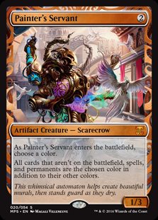
>>52420573
I wish Steel Overseer looked like that.
>>
>>52420573
woah. that is awesome.
>>
>>52431364
I normally don't call someone a shill but fucking hell, how much are you getting paid?
>>
>>52431364
>Before criticizing something you barely know think if you'd really be able to do any better. you may think yes, but the truth is NO.
Not the guy you were responding to, but: hell fucking yes I could do better. So could any anon who has ever lurked /gd/ for more then five minutes.
>>
>>52431364
>it looks like one
Look at >>52420573
Painter's Servant looks like a MTG card. It has a weird border but everything else is in place and looks like a normal card other wise.
>and? you can still point it out easily since it's the only color in the borders
Fair point but it means you cant just glance and know the color identity.
>but they are perfectly understandable and they look sculpted in stone.
Again color identity problems and ata glance information.
>it's pretty clear.
>oh no! i have to spend an extra half a second finding out if it's an istant or sorcery on a highly recognizable legacy card. Oh wait, it actually reads better on paper due to foiling highlighting the true name and types.
Look at >>52420573 again.
Everything is clear and readable. There are no problems with understanding the card if you have never seen it before.
>how dare them trying something slightly different!
Its about readability and at a glance information. New is fine as long as information is presented in a clear and understandable format
>looks good and different and majestic, especially for cards with little text. text positioning won't kill you i swear.
It does not look good. But that is an opinion so we will have to drop that argument.
>first you cry out that you can't read shit, now that words take too much space. Artist need to be credited for those fantastic artworks, you know?
The problem is because of the font it takes up a huge amount of card space and LOOKS important when it is not.
>what does that even mean?
The font for the copyright information does not match the font choices for the rest of t he card.
>medieval frescos had that window effect too.Go tell Giotto he looks CGI.Before criticizing something you barely know think if you'd really be able to do any better. you may think yes, but the truth is NO.
Frescos were also made with plaster a medium that imparts natural 3D into the artwork. In real life these cards are perfectly flat.
>>
>>52431364
t. Pre-ordered 88 cases of Amonkhet
>>
>>52431194
>already got an invention hangarback walker and an expedition twilight mire
The best part is I never buy packs, I won these at FNM
>>
File: litho orgasm am i right.png (2MB, 696x1017px) Image search:
[Google]

2MB, 696x1017px
>>52431364
>it looks like a yugioh card
Uh no. You're talking straight out of your ass. Look at good ol' Litho here. Clear, readable name. Clear and colored attribute. Clear type line. Attack and Defense are clearly laid out in a horiztonal configuration so that when you're done reading the text, you can just look down and see the a/d. The border isn't a distraction, with a clear and concise pattern. Yes, there's a lot of effect text, welcome to yugioh (as per usual, it's the summoning requirements, when ETB effect, when LTB effect). But the card itself flows correctly. You read the name, the attribute, the level stars, the art, the type, the text, the a/d without trying to struggle to read the characters.
The centered text works well with very simple effects, like Counterspell or Wrath of God, because your eye doesn't need to work as much. Invocations like Sphinx? Your eyes will subconsciously start to read and move when looking at the invocation, even if you've read the card 1000x before and know what it does.
>before criticizing something you should do it yourself
Wrong! Fallacy! Fake News!
Since they're INVOCATIONS, they should be on SCROLLS because that's what EGYPTIANS are POPULARLY known for using. Literally, all you need to do was expand the conspiracy design from the top to the bottom and change the color to beige. And around the card art, you just have some hieroglyphics that look related to the card. If it's a flying creature, have that circle above a hill somewhere, etc. No need to muddle the name or type bar either, you could just have that shit be like the Rosetta stone. Both hieroglyphics and English together, which gives it a nice feel, like they were spells sold in markets all around the ancient world.
>>
>>52431194
You don't have to get mad, you won't pull any masterpiece in your life anyway. :^)
>>
>>52430485
Sorry, I have to agree with anon here. I like the Egypt thing, and I can give the weird characters and even the vertical P/T a pass. But the border ruins it for me.
>>
I dunno. In terms of the cards they chose to make masterpieces, the Invocatiations or whatever are probable my favorite. I think the new frame is a bit weird, but I will warm up to it. Also, people say they are hard to read, but that won't come up to often in a real game of magic. If your opponents says they want to daze your spell and slam down a card that looks like a tablet, that card is probably daze. It is the responsibility of the player with these cards in their deck to know what they do, not necessarilly yours as the opponent. If you weren't going to buy these anyway, why continue to complain that they are unintelligible?
>>
>>52431827
>it's okay for Wizards to make ugly, unreadable cards because I personally like them even though 95% of the feedback everywhere has been that they're shit
>>
File: entomb.jpg (34KB, 265x370px) Image search:
[Google]

34KB, 265x370px
The art for Entomb is actually really cool.
>>
>>52431889
The arts are good (if a little too much cgi), it's the frames that are shit on them.
>>
File: 20170329_133604.jpg (2MB, 3264x2448px) Image search:
[Google]

2MB, 3264x2448px
>>52431743
Sorry bro already got one.
>>
File: containmentpriest.jpg (38KB, 265x370px) Image search:
[Google]
38KB, 265x370px
at first glance, i could instantly tell that itwasn't worth my time to try to read
>>
>>52431905
Not a fan of the borders either, the forced 3d is what really ruins it for me but the cgi art on this card at least doesn't bother me. Really fits what Entomb actually does too.
>>
>>52431889
Am I just retarded or is that guy not actually entombed at all? He can just wait for more sand to trickle in and clamber up it as the room fills, no?
>>
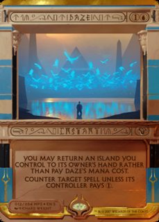
File: dazeBTFO.png (618KB, 1042x1112px) Image search:
[Google]

618KB, 1042x1112px
Confirmed for literally unreadable
>>
>>52431462
eyyy me too bud
>top a pptq
>get draft sets
>all my fuckface friends are too busy cubing to teamdraft
>say fuck it and crack my packs like a casual
>play bad get rewarded
>>
>>52431994
>current year
>can't read hieroglyphs
Step it up, bro!
>>
>>52431054
I don't have a facebook. You must have missed the part where you need to be 18+ years or older to use this site.
>>52431071
Oh, some of it is clear and concise--when it's spelled out. As you've said, there's quite a few keyworded (coin that, will you?) abilities; however, these particular cards are not aesthetically pleasing is my point.
>>
>>52431863
>95% of people think something therefore it is correct
>>
>>52431962
Yea, a few are really good, like Entomb and Mind Twist and Daze.
Others are kinda bad though, like Spell Pierce and Dark Ritual and the Commands.
And yea, my gripes with the frame: random symbols in name/type lines, monochromatic mana costs, art area shrunken for a shit forced 3d effect, card colors poorly denoted by random bars, no black border, all caps text, no flavor text, vertical P/T, and the arts could've been a lot more associated with the effect (Dark Ritual is neither dark nor ritual-y, Attrition art looks more like a creature than a stax, Austere Command is just the cat god standing there, not even firing the bow or anythig)
>>
>>52431982
Well it's falling in from three sides and he's already waist deep in the sand. The sand is going to pile up on all three sides of him, if he tried to make his way up on one of the eventual 3 huge piles of sand they'll probably just fall apart and he'll fall back down with a huge pile of sand on top of him. Also naturally he'd be panicking.
>>
>>52432036
Hard to be right when there's so much wrong.
>>
>>52431994
>Daze's mana cost
>I wonder how the card is called
>>
>>52431994
That art may be the only redeeming quality of this set.
>>
>>52432064
Not everyone plays eternals, and so won't know Daze off the top of their head.
>>
>>52420093
If I pull one of these ugly pieces of trash I'm selling it right then and there. I don't want any of them in my collection and I have fucking dollar rares in my binder.
>>
>>52431982
Nah, it will become a quicksand like consistency.
>>
>>52432050
Agreed. The art for Dark Ritual and Austere are the biggest offenders so far. The invocations have just entirely been hit or miss on the art being related to the actual spell.
>>
>>52432153
You don't have to worry, you're not going to pull one. :^)
>>
>>52425898
>Mind Twist
Why would they reprint one of the most overpowered cards of the game? What's next reprinted Ancestral Recall?
>>
>>52432179
They're not standard legal you dummy
>>
>>52432205
But they are limited legal, so RIP anyone going against the guy that pulls Mind Twist or Force of Will
>>
>>52432179
All the invocations are at a super mythic-rare rarity level, so you'll see like 1 in every 6 booster boxes. They're also not standard legal. But if you're lucky enough to pull Mind Twist in limited play (where they will be legal to play) you've earned your right to play it.
>>
>>52432205
Does any player actually look at those tourney formats rather than just creating the most powerful deck they can with their card pool?
>>
>>52431925
Man, you know, what REALLY fucks this up for me is the keyword being centered on the middle when the card is not symmetrical at all.
And the textbox has nebulous rules, and, and, what the fuck were they thinking? Why is the P/T vertical JUST so that it can interfere with the last line's positioning?
Shouldn't a graphical designer have taken fucking script classes at school? I'm a stonesculptor and I sure did. Even the spacing for the font up there is nonexistent, it's a horrible fucking font that has its letters end on the last pixel so that even I next to N is a huge hole. The fuck is all this?
>>
File: 1449161724452.jpg (19KB, 258x196px) Image search:
[Google]

19KB, 258x196px
>>52432243
Are you seriously asking if anyone plays constructed Magic and not just table top?
>>
File: IMG_7108.jpg (101KB, 410x546px) Image search:
[Google]

101KB, 410x546px
GUYS! THEY LEAKED ANOTHER ONE OF THE INVOCATIONS!
>>
>>52432281
you're 20 hrs late on that m8, that was literally the first joke
>>
>>52432229
>so RIP anyone going against the guy that pulls Mind Twist or Force of Will
Force of Will is only good against combo decks. I'd argue Kaladesh had a higher amount of insanely ridiculous cards as Masterpieces (GL fighting that Wurmcoil Engine or Sword)
Most of the ones this time around are pretty pathetic in limited, which is a good thing- Daze is an awful counter without land destruction, spell pierce as well.
Consecrated Sphinx is super strong though
>>
>>52432281
Hoho so funny joke and original!
>>
>>52432229
FoW in limited is less gamebreaking than Kaladesh' Sol Ring.
>>
>>52432320
my buddy pulled a wurmcoil during the prerelease, he still didn't do that well
>>
>>52429987
I hated "Masterpieces" too. Stop making shitty looking gilded garbage and give me a reprint of a decent looking card.
>>
>people not understanding that they are meant to be artistic collectors items
they look fantastic
they don't have to be readable for the same reason things like full art cards don't even have to have their text printed on them
you can play with them if you want but they are meant to be in a collection and looked at rather than actually played with
>>
>>52432419
shame they look ugly as hell
>>
File: Players Don't Matter, Only Collectors Matter.png (238KB, 2200x1302px) Image search:
[Google]
238KB, 2200x1302px
>>52432419
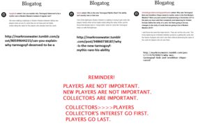
>he things investing in cardboard is a good idea
>he subscribes to pic related
Retard alert.
>>
>>52432352
he fuckin sucks then desu
>>
Anyone shopped the -just fuck my shit up hair to MaRo yet?
>>
>>52432448
>collectors first
>ultra rare 1.5 in a case cards to help keep the price of the set down
I actually don't understand
>>52432438
this I can get
if you don't like the way they look thats a perfectly valid complaint even though I disagree
but thinking that printing a set of super rare cards in sets to add a collectors item to them is favoring collectors above players when we get a whole new set to play with is delusional
>>
>>52425667
Any sane Magic Player sleeves their cards making border rules pretty pointless.
If you don't sleeve your hundreds of dollars or delicate cardboard you don't deserve to play.
>>
>>52430255
I kinda like the idea of calling the bird Willi.
>>
>>52429085
>20 minutes
Lot's of those digital paintings take over 20 hours at best.
>>
>>52432563
And yet they still look like shit.
Also, there's no apostrophe in lots. Learn to punctuate.
>>
>>52432303
>>52432326In my defense I just saw these these a minute or two before posting.
>>
do we know which of the masterpieces are from the actual set?
or were there any?
>>
>>52430018
Of course he's ignoring it. They probably need to have a board meeting or something to decide how to best proceed with damage control.
Keep in mind MaRo, is just the face. There is a group of people running this stuff.
>>
>all the art is practically CG shit
RIP
>>
>>52432629
Gearhulks were spoiled last.
>>
File: large[1].jpg (82KB, 785x820px) Image search:
[Google]
![large[1] large[1].jpg](https://cdn.4archive.org/tg/thumb/1490/812/1490812188568s.jpg)
82KB, 785x820px
Well played WotC. I almost believed them real
>>
>>52432704
oh do we not have all of them yet?
I thought they said 100% would be spoiled by today
>>52432711
>card game based on egypt
>set based on egypt
>cards look similar
who would have known?
>>
>>52432772
All except the Amonkhet first prints.
Like how the Kaladesh masterpieces were all spoiled except the Gearhulks.
The ones here are probably the Gods of Amonkhet.
>>
>>52432772
It's already everything. the other 20 is for the 2nd set as usual.
>>
Spotted from Leddit.
"Maybe they're bad on purpose because Wizards is conducting secret testing on what factors influence secondary market value.
"Ok, let's try printing sought-after playable cards, at super high rarity, but they're super ugly -- and see how much that effects price"
Thoughts?
>>
>>52432818
"These fucking retards are still buying them! Some chucklefucks are even buying full playsets! Oh god, the Department of Health has classified the cardboard crack epidemic as worse than opiates! People are sucking off hobos just to get the chance to lick one of these cards! What have we done?!'
>>
>>52432591
okay grandpa.
>>
>>52432818
>thoughts
>hey lets sabotage our own product for innane reasons
well that's reddit for you.
>>
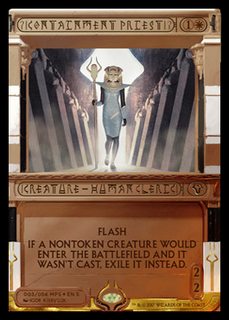
>>52431925
>?!CONTAINMENT PRIEST!?
This one's name is actually easy to read, I just never knew a card outside of Un-sets to have punctuation marks other than hyphen on them
>>
Why are people saying the names on these cards shine? Cause they don't from what I saw.
>>
>>52433131
noone said that.
>>
>>52433158
Yeah people have, they said the name stands out and is foiled, not in this thread but I heard it
>>
>>52432320
No! Shut up! Force of Will is BROKEN! It's single handedly the thing that makes blue the best color in magic in every format it is legal in! If it was in modern the metagame would just become Miracles 2: Electric Boogaloo! You stupid blue cuck don't you know that counterspells are anti-fun? Do you want the game to die?!
>>
>>52431994
that says "nitidazenit"
>>
>>52432229
FOW is generally pretty horrible in limited though, unless its something super powerful like a cube draft.
>>
>>52433313
Force of Will either gives card disadvantage or it costs more mana than every viable spell. In either case it's garbage.
>>
>>52433551
REEEEEEEE SHUT UP I KNOW WHAT I AM TALKING ABOUT I PROXIED A PLAYSET IN MODERN AND WENT 500-0 AGAINST MY LGS
>>
>>52420573
how is that a scarecrow lol
>>
>>52429318
>>52429284
>>52429280
>>52429274
>>52429260
i mean yeah these suck ass but like Tempest up until idk Torment or maybe even Mirrodin had solid and interesting art
>>
>>52432563
steve argyle please leave
>>
>>52420093
Yeah, so if these were like *half* as much it would've been fine. Not wonderful but tolerable, with the small handful that actually looked okay.
As they are this is way too much and they're an incohesive mess.
>>
Wizards isn't actually printing these right? This is just an early April Fool's joke right? Don't these cards literally violate the rules for legal proxies?
>>
normal cards the frame is flat and the art is 3d
this frame is so fucking 3d it makes the art look flat in comparison
>>
>>52434433
I guess now you can just run Yugioh cards are proxies.
>>
>>52429842
>Putting in things that make art eye catching and generally good is bad and cheap and shouldn't be done! Wizards should invent their own philosophy of art before they even begin to make anything ever again!
>>
>>52432419
>people not understanding that they are meant to be artistic collectors items
this is not a painted vase or a handmade sieve print or a RA-4 process enlargement its
Offset machine printed cardboard stock with blue shit inside released to an international market that touches cards with latex gloves and puts 2 layers of sleeves over none of this shit is gonna matter in 5, 10 or 20 years
>>
>>52433131
It would make sense for them to stand out in someway on the actual card given how terrible it looks as an image.
I would hope they'd do that, anyways.
>>
>>52432064
You shouldn't have to reverse engineer what a card is by reading the rules text
>>
File: Two Arms.jpg (61KB, 312x445px) Image search:
[Google]

61KB, 312x445px
>>52433028
>>
File: acorncatapult.hq.jpg (196KB, 480x680px) Image search:
[Google]

196KB, 480x680px
>>52434748
>>
>>52431740
>parchement boarders with hieroglyph ART
>>
>>52420543
I'm making a folder for basic ass wotc shills like this. Anyone want to help contribute?
>>
>>52434940
not in terms of flavor or what the mechanics of the card represent in in-game-world-logic; anon means in terms of the actual name of the card. Your analogy would be pertinent if the top of that card read "??!AOAOROOROON CA++*QQOUTT!!?", and then the rules text simply read "acorn catapult".
>>
File: pretty cards.jpg (175KB, 1141x761px) Image search:
[Google]
175KB, 1141x761px
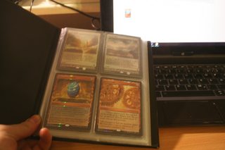
>all those people mentioning complaining about cards you'll never get
>not getting masterpieces just from drafting every week
>>
File: Timber Wolves.jpg (177KB, 480x680px) Image search:
[Google]
177KB, 480x680px
>>52434940
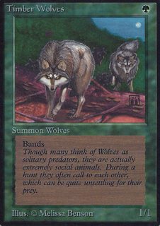
>Squirrels have stats on par with Wolves
How can someone look at this card and believe this is acceptable lore wise?
>>
>>52435337
>the kalonian word for "ammunition" is the same as the word for "bait".
>>
>>52435337
wolves are 2/2s these days
>>
File: invocation edit2.jpg (332KB, 800x558px) Image search:
[Google]

332KB, 800x558px
>>
>>52431994
Honestly I can forgive everything about these except for the hieroglyphs, and I could forgive those if they used iconic art. As it is you can't tell what cards these are at a glance, even if you're familiar with them. Which slows the game down and is incredibly annoying.
>>
>>52435337
That's because there's not much you can do at small numbers and still be able to attack worth a damn.
Most humans are 1/1. Most wolves nowadays are 2/2, though, Timber Wolves are just scrawny.
>>
>>52435468
i really wonder how these will look in japanese mtg
>>
>>52435511
They're english only.
>>
>>52435534
aw fuck
imagine them written in kanji, would look fucking noice
>>
>tfw your step dad hates you and when you tell him to stop hurting your mom he rips up your magic cards
It sucks cause he's smart and doesn't bruise either of us, but would the cops even do anything if I showed them my ripped up magic cards? Is that destruction of property?
>>
File: Untitled.png (369KB, 401x555px) Image search:
[Google]
369KB, 401x555px
>>52435469
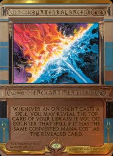
Yup
>>
>>52435586
They won't. If you can, I'd recommend the age old adage of knocking him the fuck out the next time he lays hands on your or your mother.
>>
>>52435468
I would have been happy with that.
>>
File: COUNTERBALANCE.png (1MB, 1920x1080px) Image search:
[Google]
1MB, 1920x1080px
>>52435604
Fuck that looks so much better
>>
>>52435468
Instant improvement
>>
>>52429471
Respectfully disagree. Daze looks good.
>>
File: mby2prUFK5xir-FRAPjNZhPpWwBusGTbqjYxpv23vd0.jpg (85KB, 552x767px) Image search:
[Google]

85KB, 552x767px
>>52435902
So does Vindicate.
>>
>>52435902
I also think mindtwist looks okay
>>
>>52435902
the spell pierce looked amazing.
>>
>>52435947
I have no idea what's going on on vindicate, it doesn't show anyone being vindicated, it just looks like it could be art for any number of kill spells
>>
>>52432159
>Biggest offenders are Dark Ritual and Austere Command
>Not Worship
The new art for Worship is far and away the worst art I've seen on a modern border Magic card.
>>
>>52429549
What do you even think is wrong with the card to begin with to think that horizontal stretching, shrinking the image, and blur was going to improve the card?
>>
>>52434823>WE AT YO MOMMA HOUSE
>>
>>52436061
that's the old card, new one is on the left
>>
>>52435947
>>52435950
I was specifically referring to the claim that "Every single invocation that counters things looks like garbage"
>>52435962
I dislike Spell Pierce. I generally don't care for spells that have the big awesome legendary creature casting them. I also think that, while better than Force of Will, Spell Pierce is just bright particle effects on an otherwise unremarkable piece of art. Pact of Negation is better IMO.
>>
>>52430299
But... They are making packs sell better. There is no way these hurt pack sales or even come close to costing more for them to make then they are making from them
>>
>>52436083
No it isn't.
>>
>>52436127
it is, the actual cards have tiny art, look at >>52435947
>>
>>52436125
You're thinking of absolute cost rather than opportunity cost. If the criteria for a generally bad business move was to make your product cost more to make then you can profit from it, companies would self destruct without ever making a "bad business move".
You have no concept of margins or anything.
>>
File: 149080969.png (438KB, 598x749px) Image search:
[Google]
438KB, 598x749px
>>52431994
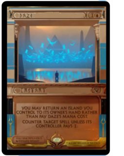
Instantly much better, even with the horrid shoop skills.
>>
I plan on getting as many of these as I can for Legacy BUG Control, and then getting the rest of the deck altered to have the borders (including duals, fight me).
I love these, I hated the Zendikar expeditions and was meh about Inventions, these are bizarre, unique, and fantastic.
>>
>>52429549
God I feel sorry for the person who has to face this in draft
>>
>>52420093
>magic is a thinking man's game
>I hate thematically puzzling out meaning from obscurity
I can't square these two. Who the fuck needs to read the title every time, anyway? It's just like when in the past you didn't like the art on a card. Get over it or stay triggered.
>>
>>52436238
I NEED my cardborders to be black or white, not this shit, it triggers my autism (legitimate), things aren't even centered!
>>
>>52431994
>Tim init daze init
Amonkhet confirmed for chavs
>>
>>52431994
There are fools who actually cannot read that? They even boldfaced it for you, like they do in textbooks to guarantee it catches the eye and to give additional emphasis.
Literally what the fuck is wrong with you people. Disagreeing with the design choice on thematic or aesthetic grounds is defensible; "nigguh I can't read this" is not.
>>
>>52436255
>centered
Think of the frame rather than the art itself as that which is centered. It can help.I pity you who are unable to do this naturally.
>>
>>52436190
>you have no concept of margins
Not that guy, but it's sounding like you just took Freshman Econ. There's no special process to make the Masterpiece, or Invocation, or whatever-they're-called cards. The only additional cost comes from the money it takes to, say, brainstorm the idea for the design and then pay people to execute it. So the marginal cost is very low for these types of cards. The demand has to increase just a small amount, then, in order to make the special ultra-super-rare cards worth printing.
In regards to opportunity cost, you might be right. It is probably true that they could have made special cards that would have been better-liked (and therefore more sales-generating). At that point, though (if you've granted the above), it's just a matter of how much extra money wizards makes. This as opposed to your original post, which made it sound like these cards are somehow a financial burden on wizards.
>>
File: Authentic Asian font.png (294KB, 3062x1466px) Image search:
[Google]

294KB, 3062x1466px
>>52436320
I can't wait for Kamigawa masterpieces!
>>
>>52429284
Shit, with bigger res they even look worse
>>
>>52429988
>Terese "All my illustrations look similar and have the same feel" Nielsen
Nah, McKinnon is where it's at
Guay is great tho
>>
>>52436352
>in regards to what you actually said, you might be right
What a moron. What, pray tell, do you consider my original post?
>extra money
Your understanding of economics and business is painfully lacking. Are you an advocate of ancap or something similarly foolish?
>>
>>52436360
Again, saying the typeface is ugly is one thing; saying it's illegible is something else. Can you really not read "REAL WOK" in that image?
>>
>>52436377
>all my illustrations look similar and have the same feel
That's how you get to be a great artist - when you have a singular distinct style that's great all around.
>>
File: edit comparison.jpg (344KB, 894x652px) Image search:
[Google]

344KB, 894x652px
>>
>>52436421
Did you know that there are a lot of american youth today that can't read cursive writing? The same with this really.
>>
>>52436448
god the coloured mana symbols look so much better
>>
>>52436493
cursive is fucking awful anyway
>>
>>52436448
Wholly worse. If you don't understand the aesthetic, remove it completely.
Limp half-measures and ineffectual compromises are repulsive. If you prefer no border or a border without character as mere frame, do that. Don't pare it down to an ugly bastard that achieves neither goal.
Full card art works. Border as negative space works. Border as subjective frame works. Don't dilute these together without understanding what makes them good.
>>
>>52436430
Don't confuse never getting out of her comfort zone as style, Anon
>>
File: fucking shitty grapes.png (80KB, 688x1434px) Image search:
[Google]
80KB, 688x1434px
>>52436518
Provide analysis of why it's awful, or resign your position to be no more than this.
>>
>>52436518
I see you've never written anything by hand.
>>
>>52436629
it makes text so much harder to read and is barely quicker than writing legibly
>>
what's with the Egyptian tone?
we yu gi oh nao?
>>
>>52420093
Well, that's certainly different.,
>>
File: 1416789849157.png (500KB, 500x500px) Image search:
[Google]

500KB, 500x500px
>tfw I thought they were ugly as sin at first
>mfw the more I look at them the more I like them
They're just so cheesy, like, "NA NA NA NA NA, DANCE LIKE AN EGYPTIAN" in card form.
>>
File: postmodernists making fun of themselves.png (120KB, 1177x437px) Image search:
[Google]
120KB, 1177x437px
>>52436653
>harder to read
It's easier to read what you've practiced reading and easier to write how you've practiced writing. The reductive tendencies in your position are worrying, too.
Is this what passes for analysis now? My objections come from the position of someone who fully supports printing as the dominant writing method.
>>
>>52431994
The main problem is that they added all that dumb hieroglyph bullshit immediately to the left and right of the actual word.
The other main problem is that the font they use is scribbles instead of real letters.
The main problem X is that the mana cost doesn't use colors.
The final main problem is that the whole design is shit and looks like AIDS in image form.
These might be the first "special" versions of cards that cost less than the normal version.
>>
>>52436840
Dominant from an adoption or absolute product standpoint?
>>
>>52420573
>robot
>literally painting
>in fluorescent colors at that
yeah no
>>
>>52436840
everyone's cursive writing is different so 'practising reading' doesn't really help and if I'm writing something I might as well practise writing something that others can read more easily
>>
>>52436635
since taking drafting in high school, i usually write in block letters, and my cursive is completely illegible, and takes me longer than writing normally.
then again, i couldn't tell you the last thing i wrote down by hand that wasn't a card receipt.
>>
>small art
>overly-thick frame
>abhorrent choices of fonts
>no coherence between mana cost, P/T, and set symbol
The only good thing about these is the bolas horns at the bottom and some of the new art is dope, but too small to be appreciable. Cards that look the "least bad" match the frame somewhat, like Daze and Entomb.
>>
>>52436866
Adoption, since we're talking about manual printing. Sorry, I should have specified from the start.
>>52436895
Practice does help identifying common structures in differing presentations, though. Not being able to write cursive doesn't bother me terribly, but you should be able to read it.
Like any kind of writing, printing is also only as consistent as skill, model, and will allow. I suppose you could argue that cursive is more expressive an instrument than printing, but that's a little out of scope here I think.
You've given a reason and broken it down so it can be analysed and compared. I'm legitimately proud of you and hope you continue the habit on your own.
>>
>>52437047
I can read cursive, it's just annoying compared to less elaborate writing styles because it takes longer to scan read, it's an outdated method of communication in a world where most text is typed anyway
you massive fucking autist
>>
>>52437101
Good for you, glad you can manage to read cursive.
>you massive fucking autist
Where did our conversation enter direct insult territory, wew lad. You should also check the science on some of your suppositions lol.
>>
>>52437177
I know. I was about to fucking compliment the anon for participating reasonably in discussion, too. Fuck me.
>>
>>52437195
he was being a condescending cunt
>>
File: WS209903-271x380.jpg (28KB, 271x380px) Image search:
[Google]

28KB, 271x380px
Don't think this one was posted yet but this is the most disgusting one of the bunch by far.
>center the font
>leave the bulletpoints intact, making it off center
POTTERY
>>
File: 1486974227343.png (39KB, 620x456px) Image search:
[Google]
39KB, 620x456px
>>52436210
>>
>>52431911
>Sheltered Valley
My nigga
>>
>>52435329
The odds are mind bogglingly low for most people though. 1 in 144 boosters is insane. I've only done one draft of this set, but somehow cracked open a masterpiece Trinisphere. If I opened up an Amonkhet """masterpiece""", I'd probably vomit.
>>
>>52437235
I suppose you would have branded me a right cunt too if I had gotten around to complimenting you. Some people self-select out of useful discussions.
>>
>>52436840
>cursive
>continental
true patrician
>>
File: the_mummy.jpg (111KB, 1024x768px) Image search:
[Google]
111KB, 1024x768px
>cgi art
>>
>>52437398
I want to fucking punch the intern that made this shit.
>>
>>52437652
if you're stupid enough to not see how much of a condescending prick he was being then that doesn't make you a right cunt it makes you a fucking idiot
>>
>>52437667
Check the filename. The image mocks both, each accordance with its nature.
>>
>>52437716
>If you're too stupid to see how much of a condescending prick he was being, you're not a right cunt - you're a fucking idiot.
>>
>>52438055
The distinction is pretty dumb in the first place, it's only good to keep the rivalry from a memetic console shitposting war standpoint
>>
>>52438103
Remove "being", and you've got yourself a fine sentence.
>>
>>52436448
>Courterbalarce
>Erchartmert
>>
>>52438118
t. Americanist
>>
>>52438168
Hardly, I'm pretty much as close to a "continental" as anyone can be, am not american and think as a whole, american academia has done more bad than good, I just don't like how one side usually dismisses the other as psychobabble / undiluted autism
>>
>>52436913
Pretty much. The older generation likes to flaunt a skill they have the younger ones don't. If you never write anything by hand, there's no real reason to know cursive unless you intend to read a lot of old shit that wasn't typed.
My cursive is such a shit show, I pretty much forgot some of the letters and just sub in my own when I need to.
>>
>>52438215
>psychobabble / undiluted autism
Clearly it's not. I would have thought it was clear to all that the portrayal from the image in question was hyperbole, though.
Incidentally, I wasn't accusing you of preferring the analytic school but rather of dismissing the distinction as dumb or worthless outside of the scope you mentioned.
>>
>>52429757
What is maelstrom pulse?
>>
Rolled 2 + 2 (1d4 + 2)
rip
>>
>>52436840
It revulses me that pepe is now associated with Trumpism. How far the memes have fallen.
>>
File: en_YuUIESSRM1.png (183KB, 265x370px) Image search:
[Google]
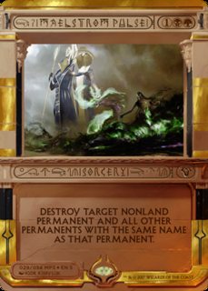
183KB, 265x370px
>>52435947
>this looks good
Joke post? The artist literally copy/pasted the 3D model of croc-god between that card and this one, and used different Photoshop effects for the "magic". Then there's the perspective issue of the white god's lightning bolt being the same size in the foreground and background.
>>
File: BroFistisMaximum.jpg (18KB, 480x360px) Image search:
[Google]
18KB, 480x360px
>>52436210
>That entire post
>>
Prediction: Gods will be artifacts that use brick counters to become creatures
>>
>>52439513
I doubt it unless you have to remove the bricks to cause the transformation. There'd be too much confusion with -1/-1 counters floating around.
Of course the whole design looks like shit so who knows.
>>
>>52439513
Hope not.
Or maybe I don't. I don't even know. I just hope the set I've been hyped since the announcement last year is good.
>>
File: Ahhahaha faggot.jpg (21KB, 202x249px) Image search:
[Google]

21KB, 202x249px
>>52420093
>MFW i'm gonna buy up all of these entirely just to piss off my local legacyfag group
>MFW they will throw an absolute shitstorm of epic proportions and i will like it
>MFW they will grudgingly accept this cause it will be legal and they will be butthurt every week for the rest of forever
yes, YES!
>>
>>52439663
That's only going to work if you play Miracles
>>
File: OY4582d.png (214KB, 659x676px) Image search:
[Google]
214KB, 659x676px
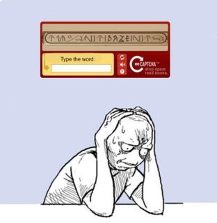
>>52420093
>MTG shills justify this?
>>
>>52420621
That's literally unusable though. All anyone that's not autistic can tell is that it's Psychic, its attack uses two Psychic energy, and that it's strong against Psychic types. These new masterpieces are all in plain english not random lines.
>>
>>52440200
See
>>52440105
Tell me what that says you little faggot.
>>
>>52440105
>comparing the card titles to impossible Captcha
Do the words "Consecrated Sphinx" not fucking leap off the card with the most casual of glances?
Sometimes I think the people throwing shade with strawmen are the mtg shills trying to generate hype.
>>
>>52440256
It says "Daze". Are you actually a fucking ascended spambot, or why can't you read that?
>>
>>52433579
Ironic shitposting is still just shitposting
>>
>>52440260
>leap off the card with the most casual of glances?
Actually, no
Yes it's obvious what it says if you stare at it a second but that's not very good design in that case. I want cards and WORDS to be as instantly readable as possible.
asdjfsBUTjsdo1111perhapsif0-ssyouhaveasasasautismPOOOTthenmaybeniggers;''\\\itm/,/looksp[]coolandnonintrusive?!3092
>>
>>52440105
>notindazeinot
Is this a new card?
>>
>>52440256
It says DAZE in big black letters, sorry you're too retarded to read. Please go on and try to tell me what that Mew card's attack is called without looking up a translation that had to be spoonfed by Nintendo for anyone to know.
>>
I GAVE IT A SHOT GUYS
>>
>>52440314
>spot the implicit strawman
>>
>>52440359
Why did you make the non-name text so light? It was already light enough to discern from the real text.
>>
>>52440359
Waaaaay better than some of the attempts so far.
>>
>>52435981
There are literally zero versions of Vindicate that show real vindication you autist.
>>
>>52440386
Agreed, but at least their changes followed some sort of effective logical direction.
>>
>>52440467
Not them. I hate how autist is used to mean both people who bother to be right and people who don't.
>>
>>52440348
I can't believe how blind some of you are if you can't clearly read it.
The card is TIM NOTIBAZEINOT
>>
>>52440285
Because it was intentionally designed to be illegible the first time, mtg drones will eat anything wizards shits on their plate.
>>
>>52440485
People who bother to be right aren't autists, it just seems like that because it's a popular tactic for losers trying to talk shit when they've been cornered. A true autist would complain about something that has no relevance to anything and is just trying to contribute to fit in, like >>52435981.
>>
>>52440550
>People who bother to be right aren't autists
Of course they aren't, I simply described how the term is used.
>>
File: amonket.png (614KB, 1240x401px) Image search:
[Google]
614KB, 1240x401px
The first time I see them I think that would be fan art, some kind of bad joke, then go to wizards and dissapont.
Almost ashamed to saythe much I saw it the more I like it
>>
File: 1490462190157.jpg (79KB, 470x594px) Image search:
[Google]

79KB, 470x594px
Whats going on here, what format are these legal in?
>>
>>52440542
Wow, you actually understand that the turnkey design was intentional? And still hate it? What the fuck is wrong with you?
Do you not see the effectiveness of what they've done?
>>
>>52440628
Considering the rules stipulate that only cards with black or white borders are legal for tournament play, any casual format.
>>
Why there are no green cards in this amonkhet style?
>>
>>52440636
They probably complain when someone uses a foreign card, too.
>>
>>52440652
Oh so they are promo cards, its like a treasure hunt in the sand.
>>
>>52438527
8 years
>>
>>52431194
Mine was Noxious Gearhulk from my pre-release kit.
>>
>>52440359
why is this a card worth reprinting? Hymn of tourach is cheaper for the value, and using it on turn 4 or 5 seems like a waste. Is it a sideboard card against card advantage decks or something?
>>
>>52428999
>inb4 some SJW gets triggered because this card reminds her of that time her uncle used the force of his willi
>>
>>52432274
>table top
>not kitchen table
shiggyfam
>>
>>52440783
Why is aggravated assault worth reprinting? That one really makes no sense.
>>
File: serveimage.jpg (791KB, 2048x1536px) Image search:
[Google]

791KB, 2048x1536px
>>52435337
Lol why does that wolf have Amy Winehouse hair?
LIke just fuck me up senpai.
>>
>>52440386
Fucking hardly.
>>
>>52436125
That remains to be seen. I sure as hell haven't been buying any packs, and neither has my playgroup.
>>
>>52436629
Block text is hard to screw up. Cursive is less uniform from person to person. By having the letters link up together a quickly written word is reduced to a illegible squiggle. Cursive sucks, because most people suck at writing it.
>>
>>52440783
Mind Twist strips the entire hand very early in the game when fueled by Dark Rituals and Cabal Therapys. It's actually banned from Legacy because of this.
>>
>>52437101
>you massive fucking autist
You fuckers have killed the meaning of autist. It comes across as a lazy and banal insult. This is the first time I have agreed on it's use.
>>
>>52441994
Writing in cursive is better for both analytical and creative thought, and for the memory. Typing, unfortunately, lags far behind in these benefits.
>>
>>52436202
Looks a LOT more like a mtg card I give you that.
>>
>>52442308
Are you referring to the NY Times opinion piece, or an article by one of the less reputable publications?
>>
>>52442060
Yeah and land tax got you insane card advantage and thinning. Shit like this and mind twist are no longer ban worthy
>>
>>52442486
Not them, but I learned to write cursive in the past 8 months after decades of very competent typing. My productivity and creative output in that time has gone from day to night and changed my life. I go everywhere now with a notebook and a pen, and will never stop.\
This is not a scientific offering, and I'm not trying to present it as one. I ask you to just fucking try it for yourself if you are working in a creative field and currently keeping notes on laptop or smartphone. Judge the difference for yourself.
>>
>>52442968
Okay so anecdotal evidence then. Here's mine. I was raised to write cursive. It had no benefits other than giving my hand cramps, and fucking up my block print. After switching to a digital format for writing I have found my productivity and creativity skyrocket. Being able to go back over my notes from class and edit them, or move them to my mobile devices has been one of the best things for me.
I am not saying you are full of shit, cursive clearly works for you. However I stand by my statement that most people can't write cursive for crap. The format has dying out, even before the widespread use of word processors.
>>
>>52443112
>being raised to write cursive fucked up his block print
>still has hand cramps after years of cursive writing
No need to make up a snarky lie, I was upfront about it being an anecdote and not a rigorous academic proof.
Just one person trying to help another with my personal experience. Old fashioned, I know - probably a dying pattern.
>>
>>52440285
>>52440358
>in big black letters
small dark grey letters, next to mid grey symbols
The D looks like a symbol,
the A could just as easily be an R,
the Z is readable,
and the E looks like it should be a different letter (but has no clear alternatives to E)
>>
>>52443282
Letters are symbols. The A is no closer to an R than a written A. The Z is no closer to a written Z than the other three letters resemble what they represent. The E is probably the clearest symbol there.
Basic human pattern recognition hasn't changed just because of the decline of cursive writing. Your problems are your own, and if this is how you deal with them I'll be glad to see you left behind.
>>
File: wait what.jpg (66KB, 528x792px) Image search:
[Google]

66KB, 528x792px
>>52420093
>itt
>people who can barely read are tripped up by a visual effect that my 6 year old can deal with
>try to pass their butthurt off as well-reasoned criticism
>>
>>52443203
>snarky lie
Nice job casually dismissing my point. I was being straight with you. When I write quickly, and under stress it turns into an illegible mess of script and block. This is one of many reasons I prefer using a computer.
Feel free to continue your pseudoscience anecdotes. Or you can continue with the personal attacks. It's not like that will erode the remaining authority you had in this discussion. That last part was snark btw, learn the difference.
>>
>>52443552
I'm not trying to prove anything, just trying to help you out as I said. Don't worry, I won't try again.
>>
>>52440662
Nissa yet again opens a can of whoop ass on the enemy force with a friend by her side, Bolas is defeated within only the second set he appears in because muh Jaceticeleague, and Green cards become the majority in Hour of Devastation.
I really hope Wizards actually has a twist this time around. The Jacetice League can't win EVERY battle, right?
>>
>>52443112
>raised to write cursive
>can't do it without hurting
>can't write block letters properly as a result
That's called failure, anon. Yours, not cursive writing's.
>>
>Not trying to prove anything
These posts suggest otherwise.
>>52442308
>>52442968
>trying to help
Calling me a lair is a funny way of doing that.
>>52443203
>I won't try again
That's for the best. Based on our conversation you are really bad at helping others.
>>
>>52443746
Would you mind explaining the decline of cursive writing then?
Thread posts: 351
Thread images: 61
Thread images: 61

