Thread replies: 104
Thread images: 45
Thread images: 45
Anonymous
How's Your Webcomic? #361: Let's Try This Again Edition 2017-04-23 06:26:06 Post No. 91775143
[Report] Image search: [Google]
How's Your Webcomic? #361: Let's Try This Again Edition 2017-04-23 06:26:06 Post No. 91775143
[Report] Image search: [Google]
File: 1468956345054.jpg (328KB, 750x750px) Image search:
[Google]

328KB, 750x750px
How's Your Webcomic? #361: Let's Try This Again Edition
Anonymous
2017-04-23 06:26:06
Post No. 91775143
[Report]
You've got a webcomic, right? Post about it here. Share WIPs, pages, drawings, scripts, whatever. Get comments and critique.
Thread Activity: Draw genderbent versions of your characters! How do their personalities change with this?
>>
File: 1468956414970.png (871KB, 612x792px) Image search:
[Google]

871KB, 612x792px
Scrub Authors GOODIE Bag
Here’s a short list of sites that any new webcomic artist/writer will find handy:
>*-Struggling to find that perfect FONT? Create your own using this link;
http://www.myscriptfont.com/
>*-Don’t forget to brush up on that ANATOMY:
http://artists.pixelovely.com/practice-tools/figure-drawing/
http://www.quickposes.com/pages/timed
>*-What’s a list without some reference STOCK IMAGES?
People: http://senshistock.deviantart.com/gallery/
Scenery: http://www.shutterstock.com/
>*-Here's a big fat compilation of CHARACTER DESIGN REFERENCE:
http://www.pinterest.com/characterdesigh/ (surprisingly not a typo)
>Links to get a rough WEBSITE started up:
Easy to use tumblr webcomic theme: https://www.tumblr.com/theme/39018
Do’s and Don’ts for starting a site: http://pastebin.com/kNR2W5mV
>Contact sheet if anyone wants to put information down, like their site and webcomic:
https://docs.google.com/document/d/1uwfOSHXfrgvcf--PkPz9jXL6p5RqIsrYvXYwgQpgT3k/edit#
>DISCORD CHAT going on,
Ask for an invite in the thread.
>Wise words from John Cleese:
https://www.youtube.com/watch?v=5xPvvPTQaMI
>Invisible Ink:
http://courses.cs.washington.edu/courses/cse456/07su/administrative/invisible_ink_part_1.pdf
http://courses.cs.washington.edu/courses/cse456/07su/administrative/invisible_ink_part_2.pdf
http://courses.cs.washington.edu/courses/cse456/07su/administrative/invisible_ink_part_3.pdf
>Paper Wings
http://chrisoatley.com/category/podcasts/
https://web.archive.org/web/20140625035030/http://paperwingspodcast.com/
>Fonts for your webcomic on Blambot:
http://www.blambot.com/
>Writing Resources:
http://www.cienciasecognicao.org/rotas/wp-content/uploads/2013/12/Robert-McKee-Story.pdf
>Guide to promoting your comic:
http://miss-melee.tumblr.com/post/143483233951/
>Comics for makin' comics!
https://www.mediafire.com/folder/9pf1nwwa92lbp/Comics_for_making_Comics
https://www.youtube.com/results?search_query=how+to+draw+comics
>>
>>91775143
i give up
>>
File: Whatever.png (25KB, 443x820px) Image search:
[Google]

25KB, 443x820px
>>91775143
no comic, i am thinking about doing it tomorrow.
>>
File: ganbatte.jpg (89KB, 768x432px) Image search:
[Google]

89KB, 768x432px
>>91775220
Ganbatte, anon-kun! You can't give up on your dream of becoming a famous mangaka already! What's giving you trouble? We can help you!
>>
ColdFusion智 (ID: !!jbouFAho9ee)
2017-04-23 06:37:52
Post No.91775482
[Report] Image search: [Google]
[Report] Image search: [Google]
File: 20170420.jpg (1MB, 900x3399px) Image search:
[Google]
1MB, 900x3399px
>>91775143
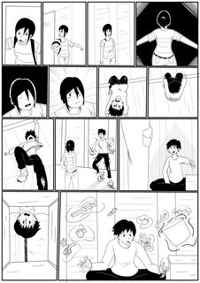
I did rule 63 twice! It was extremely contrived and weird.
have updated comic since our little thread hiatus. will post.
sadly this is the first time i've ever posted comics on april fools day OR 4/20 without them being holiday-related. but that's just the shitty way my schedule is now.
>>
File: ColorPage 220.png (42KB, 346x332px) Image search:
[Google]
42KB, 346x332px
Got a webcomic with a small viewer base, and I want to advertise it more. What do?
>>
>>91775262
You know, you are actually getting better!
>>
>>91775506
Get yourself a Twitter/Tumblr and promote your comic there, abuse tags. Interact with other artists and make friends, do guest comics/art, promote them and they might promote you back. Shill your comic, post your art around on forums and social media, spread your art all over the place. If you had provided a comic page/link in your post people would be more interested in it than if you had just posted a tiny headshot.
>>
File: ColorPage 253.png (162KB, 743x1134px) Image search:
[Google]
162KB, 743x1134px
>>91775869
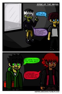
That's some good advice, I guess I'll try to be more active on them.
And here's the easiest place to read it.
https://tapas.io/episode/193216
It's on 8 Chapters as of right now.
>>
File: Whatever.png (112KB, 227x301px)
112KB, 227x301px
>>91775511
thank you anon.
i trying to look at tutorials and junk. Adding in animations in my comics. Overall, I want to have a good experience for my readers.
>>
>tfw too tired to work on project
kill me /hyw/
>>
File: chasm of the abyss.jpg (420KB, 1022x729px) Image search:
[Google]
420KB, 1022x729px
>>91776575
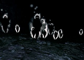
>The abyss
Hope they don't lose themselves down there.
>>
File: ColorPage 255.png (129KB, 743x1134px) Image search:
[Google]
129KB, 743x1134px
>>91776982
They probably won't die.
>>
>>91777057
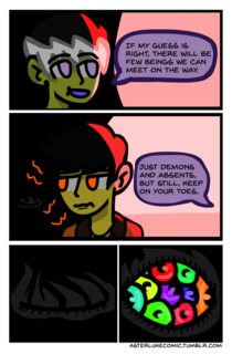
I know because of the previous panel that that's meant to be an eye with multiple pupils, but let me tell you the two major things you did wrong there
1. they overlap like fish scales, so it looks like a bunch of spheres in a hole, not a bunch of discs
2. you put a pale shine-dot right over the pupil of each one, pointing all different directions, regardless of the eye's direction. for one thing a shine dot should be white, for another.. by putting it on the pupil it looks more like a bag of multicolored nipples.
apologies if I'm mistaken and it's supposed to be a bag of multicolored nipples
>>
File: DAETHo.png (10KB, 192x176px) Image search:
[Google]

10KB, 192x176px
>>91777101
Although a bag of multicolored nipples sounds quite alluring it's sadly not true.
It's was first time trying something like this, so I really appreciate the criticism! The eye shine was something I wasn't sure about, especially since there's no light source in the first place.
>>
>>91777222
interesting. if there's no light source, is the eye itself luminous? if so, you'll want its center to be the lightest point overall but have no shines. think how a traffic light looks.
>>
>>91777399
I think that's what I originally intended. I guess it just looks funny when you're normally used to everything some form of light on top of it.
If I have time before my next update, I think I might go back and make an edit. Thanks!
>>
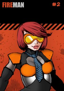
Finished this cover a while ago, quite happy with it desu.
Also kinda new to this board. How's it going you guys?
>>
>>91777617
I really like your line art. Looking good.
It's going well. Just multicolored nipples and such.
>>
File: TFTM chp1.png (2MB, 2894x4093px) Image search:
[Google]
2MB, 2894x4093px
I wish drawing wasn't so hard
>>
>>91777617
interesting outfit, kinda armory but still has a necktie
this is a pretty fun regular thread, the only problem is lately they die at night, so let's keep trying to bump it, mmkay?
>>
>>91777975
ooh what's this about?
>>
File: banner final2.png (528KB, 1280x460px) Image search:
[Google]
528KB, 1280x460px
>>91778032
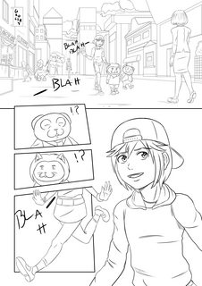
It's me trying to make something like a 80s/90s cartoon about a Kid and his panda buddy from a happyfun land get lost in a storm at sea and end up in 1989 Southern California and befriend an angry alcoholic neet girl that's given up on life, With a lot of coloring trying to look like the pastelly puke lisa frank or vaporwave colors.
I don't have much to show for it except some unfinished pages because I just started it
>>
>>91777617
Howdy doode doodoo
That's a nice design you got going.
>>
>>91778214
that sounds fun as heck, right up my alley
i have just one suggestion, and I rarely make this because usually I prefer art the way you're doing it, but
push those expressions. they should get huge, ideally kinda Slayers huge, but if it's easier, more modern kinda Kill la Kill huge.. really push that (not necessarily over the top, just big) so they look as expressive as the neon color scheme and we really feel the overt ^_^ of the happy place and the -_- of the depressed SoCal.
If you aren't trying to go THAT anime, I'd still give the same advice but suggest you watch some 80s DiC cartoons that were done in japan so they have kinda anime-lite sensibilities but still get totally rad when they emote
because no offense but right now they have a base level of expressiveness, and that means you're about equidistant from where you should be, and from soulless stuff like squeenix puts out
>>
>>91778287
You're absolutely right and thanks for the advice. The expressions is one thing I was worrying about myself. It's I have a bad habit of doing a generic facial expression since everything I've done prior to this has been generic person looking stoic.
The page I posted earlier I was going for a kind of deadpan expression for a joke about someone the character doesn't like showing up but It doesn't come off so good thinking about it so I'll take the advice to heart see what I can do with it
>>
File: seating tests.png (152KB, 700x990px) Image search:
[Google]
152KB, 700x990px
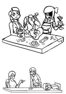
I've been playing around with making a few short skit comic things, not a fully fledged webcomic or anything. Just a "dead girls doing cute things" kinda schtick, like Girl's Day Out of the Living Dead.
Anyway, before I jump into it I want to learn more about making panels look interesting.
One issue I have is this: How do you stage a scene where characters are sitting at a table? Either characters have their back to the "camera" or you have the seating efficiency of the last supper.
>>
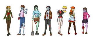
File: zombies_colourv3.png (969KB, 3428x1471px) Image search:
[Google]
969KB, 3428x1471px
>>91778534
Also, given how bright my characters are, what do I do for backgrounds? I'm thinking of no outlines on the backgrounds to help differentiate them from the colored outlines of the characters.
>>
>>91778568
I like your colors a lot, but they all have the same face, body type, and are basically the same height. Think silhouettes; I'd never know who was who if they were far away.
Also yes don't do lines on your backgrounds. Maybe even paint them to make the characters pop even more.
>>
>>91778672
yeah, I tried doing different types of eyes but I really struggle to create variation in my characters.
>>
File: Sketches3.jpg (139KB, 737x966px)

139KB, 737x966px
Still working on poses, trying to make them less stiff. How did I do?
Already know the lower right girls arms are messed up.
>>
File: Zombie girls.jpg (174KB, 970x900px) Image search:
[Google]
174KB, 970x900px
>>91778923
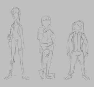
Silhouettes before details, anon. If you could literally only see the outlines of the characters, how would you tell them apart?
I did three of them and kept it subtle because you're going for something a bit more realistic. First one's very tall and skinny, second one's average and pear-shaped, third is short and stocky.
>>
>>91779417
Ah, the famous "carrying invisible barrels" pose.
>>
File: selection screen wip 2.png (656KB, 864x486px) Image search:
[Google]

656KB, 864x486px
uploaded a bit of flash animation to see how the quality looks on youtube with my current settings. Also I'm planning a layout for a menu that would appear at the end of each video that directs to other social media profiles and videos. I think this one is probably too cluttered though.
https://www.youtube.com/watch?v=hg9TS2wtKJQ
>>
>>91780006
Neat. Not sure what you were aiming for but to me it looks kinda like something you'd see in a 90's nickelodeon commercial.
>>
File: AB0090.gif (713KB, 975x530px) Image search:
[Google]
713KB, 975x530px
Making transition scenes is somehow relaxing.
>>
File: AB0091 .png (36KB, 975x530px) Image search:
[Google]

36KB, 975x530px
I wanted to draw underwater.
>>
File: aggressive rock.png (334KB, 500x375px)

334KB, 500x375px
>>91780066
You nailed it.
For these videos I'm just aiming for a cheesy 90s sci fi vibe akin to what was popular in cartoons and video games at the time. I even stole the red/blue/purple color scheme from the nickelodeon game show G.U.T.S.
>>
File: 205eb547464d53df6fbc6974bb3e5913.jpg (10KB, 400x224px) Image search:
[Google]

10KB, 400x224px
>>91780109
I dunno, I think this one is suffering from too drastic tone shift. From dark blue to pure white. The sun rays in the water tend to be barely noticeable.
>>
bunp
>>
>>91780097
What am I looking at here?
Are these characters that gonna appear in the comic later?
>>
A lot of this is hilarious without text.
>>
Edited the last page I posted a bit and finished the follow up page. Feedback is welcome as always!
>>
>>91782680
Looks fairly detailed, but the blocky heads are somewhat off putting. It just clashes too much with style of the rest of the body. Or is that intended?
>>
File: honovi.jpg (202KB, 602x1492px) Image search:
[Google]
202KB, 602x1492px
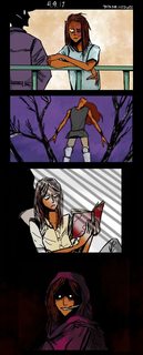
I've been slacking on my practice comic HARD, heres something i've done inbetween pages
>>
File: Hammers-Cobalt-Blue-Lobster.jpg (89KB, 952x391px) Image search:
[Google]

89KB, 952x391px
>>91781942 It's a fictional stylized crustacean called Artopod. The GIF is its life cycle.
>>91780109 I'm thinking it could prolly use some more adjustments too.
>>
File: Slide1.jpg (539KB, 1800x1350px) Image search:
[Google]
539KB, 1800x1350px
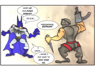
Made this. Was thinking of making a short comic out of it.
>>
>>91782680
This is fucking phenomenal anon. I think the head shape is quite distinct and helps differentiate the characters.
>>
So I want to write something set in high school, but I'm almost 30 years old, and I have no idea what high schoolers act like or do these days. Anyone have ideas on what I should study to learn more about highschool life? I also want to watch some movies or series like the breakfast club for ideas. I know its kind of old by today but I hear its still a fun watch.
>>
File: 1492468397894.png (41KB, 418x436px) Image search:
[Google]

41KB, 418x436px
>>91784183
Ah, the advantages of living in a third world country. I can read this with out needing translate.
Now, if only I wasn't so poor.
>>
>>91784475
Speaking as someone who's graduating highbschool, read posts from teenagers on social media since the internet is a pretty integral part of teenage life nowadays. Other than that, it's not too different from the tropes you'd see in older media from what I see.
>>
>>91784475
Read Serenity, it's a perfect example of how teenagers act.
>>
So I have this friend who really wants to start a webcomic and he's a lazy jackass. Someone help me give him the pep talk of the century.
>>
File: 1492389608488.jpg (209KB, 783x1179px) Image search:
[Google]

209KB, 783x1179px
>>91784959
>Easter Serenity Storytime
Good times, good times
>>
>>91784961
Comic making isn't some luxurious business, you're not gonna get money or fame from it. Your own motivation is your only drive. If he doesn't have that much, he's not gonna make it.
>>91785049
Hell yeah, mate. I was there too. First time reader actually.
>>
>>91784689
Thats so true with things like twitter, instagram and facebook these days. Thanks for the tip and congrats on graduating.
>>91784959
Oh I remember this being storytimes occasionally. Will check it out sometime.
>>
File: randm3.png (778KB, 1611x2326px) Image search:
[Google]

778KB, 1611x2326px
Working on the third main character now: Rufo Korpen is a police lieutenant who works with the official group of local superheroes as a liaison.
>>
>>91784483
I debated putting a translation but I figured it made it funnier if there's the possibility that batman doesn't even know what he's saying.
>>
are trailers for your webcomic weird? I want to have drawn video portions in my comic and I want to show people how neat it'll be.
>>
>>91785727
depending on the length of your comic
>>
>>91785892
this.
if it takes longer to watch the trailer than it does to read the comic, it's probably not necessary.
>>
File: April_22_2017.jpg (979KB, 1116x1200px) Image search:
[Google]

979KB, 1116x1200px
>>91783083
The style is intended, yes. I'm only able to work on my webcomic in my free time so I tried to come up with a style that's easy and quick to draw. My 'usual' style is too time consuming and since I'll already be using that for a commissioned comic, I figured that for my webcomic I'd better go with something simple. But I can understand it's off putting. I don't like to follow trends and be one of the oh so many Steven Universe style artists... So I kinda tried to come up with my own thing.
>>91784278
Aaw! Thank you so much, that's so sweet! I rarely get compliments like this so omg... Thank you ;_;
>>
>>91782680
Well, this is definitely good looking. Good stuff.
>>
>>91785916
>>91785892
Nah, I intend for it to be pretty long.
>>
>>91785934
You should illustrate/write a children's book (which seems to be the route you're taking?). Some may think that's a diminutive thing to say but you have a very awesome style and that it would be marketable with the right story.
The coloring is dope, matching the characters with the colors to help differentiate is a nice touch. Do the colors signify anything? Do they match the personality of each character?
>>
>>91775143
Been trying to create webcomics for a while, but don't have the motivation/confidence to really get into it.
I've only ever posted one comic online, and then immediately deleted it as I thought it was shit.
>>
File: ColorPage 157.png (48KB, 250x279px) Image search:
[Google]
48KB, 250x279px
>>91786187
That's a piss poor attitude, my dude. No one got anywhere from doing nothing. If you want it, you have to do it, plain and simple. The first comics might make you cringe when you look back, but that's part of getting better.
>>
>>91786187
fucker, I'm lying sick in bed from chemo trying to draw what I can between feeling like fucking dying and puking my brains out
fucking DO IT
DO IT
>>
File: destructive doggo.jpg (19KB, 332x206px) Image search:
[Google]
19KB, 332x206px
>>91786247
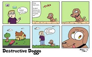
You're right, I know I need to actively draw to get into the medium, but it's hard to not look at other's work and compare it to your own, and have a bit of self-loathing creep in.
Here's the comic I deleted for anyone that's curious.
The main reason why I took it down was it's boring, and I was also censoring myself online as to not ruffle any feathers.
I've had plans to make better comics where I don't censor myself, but I just haven't really started yet, despite telling myself to nearly everyday.
>>
>>91786247
>>91786474
You know what?
Fuck it, I'm drawing today.
I'm tired of being such a little bitch when it comes to this.
Thanks anons.
>>
>>91786573
stick to it anon, its worth it
>>
I'm stuck in my OC.
This is too /a/-ish. How can I make her more /co/-ish.
>>
>>91782680
Strong rendering.
Mediocre composition and a poor sense of motion/flow. It feels like you can't decide between fluid, exaggerated motion and minimalist, static imagery. The emoting is abstract and wild but the characters have no weight in their motion or posture. The level of rendering is inconsistent even in singular objects, and it doesn't feel deliberate there. The objects and characters are feel rigid.
You've got a lot of technical skill, but you need to double down on planning and choreographing what you draw. I'd suggest Black Jack and Oyasumi Punpun as good examples of motion/posture and levels of abstraction, respectively.
>>
Nothing but a concept drawing of the main character on a paper, and i'm supposed to at least start it this year.
Spoilered because i still suck at drawing.
>>
>>91779243
looks great to me!
>>91780109
>>91780374
this. the rays are awesome but they should be a lot more transparent.
>>
>>91786711
>This is too /a/-ish. How can I make her more /co/-ish.
Draw your shit the way you want it, and fuck what other people think.
>>
>>91784475
Do you really want to depict MODERN highschool? if you're 30, don't you really want to depict highschool from the 70s and 80s, when you weren't born yet but most of your favorite highschool media was based?
>>
>>91785934
I don't love the block heads but I agree they're distinct. Reminds me of Gumby. I think you should stick with it if you like it, but feel free to stylize the bodies a bit more, go a bit more chibi and/or more blocky. that way the comic will feel like it takes place in minecraft or even moreso Bastion
>>
>>91786546
what is this, a comic for fleas?
>>91786711
doesnt look animu in the slightest. you're fine
>>
>>91788118
even this has appeal. keep working on it.
>>
>>91788321
Bit before my time since I was born when the 80s were done, But could be fun to research, what shows and media are from that era?
>>
>>91786148
Thank you so much, I'm glad to hear so! A children's book isn't exactly the route I'm going but I have been thinking about it.
The colors don't really signify that much I guess..? I do think about matching certain colors with a character's personality but it's not as if they hold any deep meaning or anything haha.
>>91787039
Thank you for your feedback! I appreciate it a lot. Motion/flow is something I have troubles with so I'll put some more thought in it for the next pages. I'm mostly using this comic for practice, since it's the first time I'm writing and drawing my own script.
Also, I don't quite understand what you mean about the rendering?
>Strong rendering.
>The level of rendering is inconsistent
I appreciate the feedback but I hope it isn't too much to ask a little explanation, instead of only hearing what you think is not good about it?
>>91788384
Thank you for the feedback! At first I'd draw the characters way blockier than they are now. I guess it didn't appeal to me because I kept making changes. But I'll keep it in mind.
>>
File: 80832a350a2baa658541638d5b707cbf.jpg (15KB, 400x300px) Image search:
[Google]
15KB, 400x300px
https://discord.gg/hc2ua
link to the discord server for the thread series
>>
File: random4.png (555KB, 1640x1180px)

555KB, 1640x1180px
Would you believe I've spent the last two hours drawing a fucking hat and a face?
I'm such an amateur. Should've come with the sunglasses.
>>
>>91789681
this looks nice for amateur
keep practicing
>>
File: Punpun on abstracted elements of character design.jpg (47KB, 480x346px) Image search:
[Google]

47KB, 480x346px
>>91789146
Your ability to render detail is, itself, a strong point.
Your rendering in the comic pages isn't consistent despite your skill.
Like, you put a lot of detail and craft into a table and a book, and then a character's ink well in the same panel is less detailed and doesn't feel like it coexists in the same space despite being just as big and having the same amount of importance. It draws your eye in unintentional ways.
This also applies to your characters, where you have stuff like in panel 3: their clothes are meticulously rendered but the faces and hands don't have the same level of detail put into them. It's better in the other panels, but it still stands out. It's not that they're cartoonishly exaggerated, because you can make that work; it's more that your lighting and "texture" doesn't apply to these parts in the same way. At the same time, it doesn't look like it's trying to go for that mismatched look either.
I rec'd Punpun because it has several examples of seemingly disconnected rendering styles. You have characters more or less realistically rendered than others, abstract figures like Punpun having different levels of rendering depending on the mood the comic is trying to express, etc. It's a good comic to study to get a feel for how you want to abstract your characters. I'm no expert, but I would advise either trying to keep the character rendering mostly consistent (like the foreground student in panels 4 and 5) or play up the disconnect between their material world (backgrounds and things like clothes) and their actual bodies.
>>
>>91789885
Nice.
I'm working a lot. I really want this to be at least nice looking for most people. I want to tell a story, but I also want it to look decent (and easy understand in a visual way).
These are just pictures for the characters' profiles, but because of it, I want them to be well drawn (or at least, the best I can draw).
>>
yo so I have not visited this thread in a long ass time, so what happened to the skype chat room for hows your webcomic? Did it completely disappear?
>>
>>91790258
The guy running it left, and it migrated to discord before that because most people couldn't deal with his shit.
>>
>>91775143
wow these threads are nothing without bones, maybe we should beg him to come back and save these threads.
>>
File: Untitled.png (277KB, 469x437px) Image search:
[Google]
277KB, 469x437px
>tfw I wanna make cartoons
>tfw I can't commit to one idea for one
I've been spinning my wheels on the issue for 10 years now, any tips?
>>
>>91790894
draw your pathetic life
>>
File: screencap.png (366KB, 504x368px) Image search:
[Google]

366KB, 504x368px
>>91789944
I get what you're saying now, thanks!
>This also applies to your characters, where you have stuff like in panel 3: their clothes are meticulously rendered but the faces and hands don't have the same level of detail put into them.
Ah, yeah, I know why. In my earlier pages I felt as if the characters seem too 'flat' and separate from the backgrounds, so I decided to spend more time on them. I guess that's why it's mismatched, but not intentionally mismatched.
I think my main problem is that I enjoy rendering a bit too much, forgetting about making it look like a whole. I can try to tone down the backgrounds to make the characters more fitting in them, because I think rendering the characters even more will make them look awkward.
>>
>>91790894
why can't you commit?
>>
I'm on the edge of my seat waiting for the artist's next round of work on the project.
>>
File: HandSketches1.jpg (136KB, 727x1001px) Image search:
[Google]

136KB, 727x1001px
>>91779243
Gotta practice everyday.
Do these look realistic or stylized?
>>
>>91792175
Realistic imo. They look good and probably do have a unique style, but it isn't immediately identifiable for me right now.
>>
>>91792175
realistic. A bit stylized, but it falls into the realistic group, imho.
>>
>>91792175
stylized can mean a lot of things. your line style has some style to it.
however you're making some major anatomical mistakes considering how extremely good you are at drawing fingers. most of it is simply the palm, you're abbreviating it too hard. The bottom left hand is right, all the others have a short palm. That, and you seem to be drawing the second phalanx of the thumb too long. Other than that, these hands are really good!
>>
>>91792395
Thank you vary much, that was vary insightful.
Not sure what a phalanx is, but I'm guessing it's the middle part of the thumb. I'll try to work on the palm too.
>>
File: genderbend.png (383KB, 1158x1094px) Image search:
[Google]
383KB, 1158x1094px
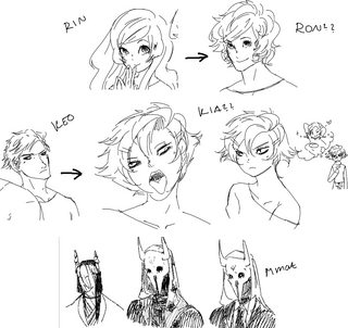
>genderbend
>Country bumpkin Ron decides to move into the city and tries to befriend his introverted neighbor Kia, believing that their meeting was an act of fate.
I don't like it, but it was fun to draw.
>Mmat
A couple of designs of a supernatural creature. He's a shapeshifter, but has turned predicting how and when you die into a business.
>>
>>91792671
Vary cute, but what kind of name is Keo?
>>
>have a bunch of worldbuilding for cringe roleplays when i was a kid
>some of the ideas/worlds are actually pretty good and i decide to use them for a comic
>now have to go back and scribble over all the names, places, themes etc that are too obvious and might tie me to my old identity, while also doing so at such a pace that the new names and characters "feel" right.
it's an abstract kind of hell
Thread posts: 104
Thread images: 45
Thread images: 45
