Thread replies: 153
Thread images: 54
Thread images: 54
Anonymous
Likable Pokemon Edits 2016-09-02 03:56:54 Post No. 28211584
[Report] Image search: [Google]
Likable Pokemon Edits 2016-09-02 03:56:54 Post No. 28211584
[Report] Image search: [Google]
File: Whiscash no dubs.png (76KB, 548x289px) Image search:
[Google]
76KB, 548x289px
Hey guys. Lets do some Edits on Pokemon that we already like, but just wish something was a bit different. We take a Pokemon and edit it, and discuss. Rules are as follows:
>1:It has to be a Pokemon you already Like.
>2: If you are dong an edit you have to post an image of the edit, no matter what form it takes.
>3: When talking about what each other did to change the Pokemon, let's attempt to be civil.
Ill Start with a few I have done.
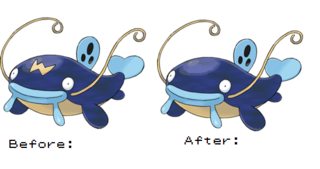
1: I always loved Whiscash but the 'W' on his head was just slightly off-putting for me.
>>
File: Palossand alt.png (56KB, 548x289px) Image search:
[Google]

56KB, 548x289px
2. Palossand may be growing on me but that extra hole between his eyes bothers me a lot. Really distracts you from the eyes in my opinion.
>>
Eh, now its head looks way too plain. Maybe remove the spots on its dorsal fin while you're at it.
>>28211612
I'm a fan of this one even though it looks a little less like a sand castle.
>>
File: Crabrawler alt.png (57KB, 548x289px) Image search:
[Google]

57KB, 548x289px
3: Although I like Crabrawler a lot and can see the concept of the black eyes, I just kind of wish it wasn't there. The concept of something that looks like a wound being part of your physiology is pretty off-putting to me.
>>
File: Mimikyu alt.png (40KB, 548x340px) Image search:
[Google]

40KB, 548x340px
4: Mimikkyu is one of my favorites from this gen so far but the club for a tail seems too cumbersome. I hope they use it as a prop in the evo because it doesn't feel like it's needed here.
>>
File: Togedarmaru alt.png (54KB, 548x340px)
54KB, 548x340px
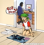
5: Togedemaru is alright as far as Pikaclones go, and if this thing were a tail I'd be fine with it but it as an antenna thing just seems really poorly placed to me.
And that's it for me so far. Tell me what you think, and maybe show off some of your opinions.
>>
Okay, I can't actually do this kind of stuff, so can I ask someone to please take Charizard Y and make his horns look more like Original Charizard's/Charizard X's?
That darn third horn ruins the design for me, personally.
>>
>>28211641
>>28211666
You lost me at these.
Nice numbers, though.
>>
>>28211639
OP here. I don't know I think he's got plenty going on for him already that he doesn't need a literal 'W' on his head.
>>
>>28211666
>in the evo
That's not guaranteed to happen evil one.
>>
File: wcwccc.png (260KB, 600x600px) Image search:
[Google]

260KB, 600x600px
>>28211686
Something was missing.
>>
>>28211695
You like the club? It just seems strange to me that he's always gotta have one arm holding up the tail-prop. If you uses it as a weapon in game it could probably grow on me.
>>
File: 600px-257Blaziken.png (216KB, 600x600px) Image search:
[Google]

216KB, 600x600px
>>28211584
I've always though Blaziken's dick fur looked kinda dumb, but now that i edited it, looks just bland.
>>
>>28211728
Yeah I like that it uses a separate object to add to the makeshift Pikachu costume.
And with Crabrawler I think the black eye adds a bit of a charm to its boxer theme. If anything I'd change the antennae. They're kinda sloppy looking.
>>
>>28211743
Naw, I'm on board with you, and I think it looks better. Some of the shit probably just looks bland because we've seen it there for so long that it looks strange without it.
>>
>>28211584
The W on it's head makes it look like it's an electric type
>>
>>28211703
It's not just a "W", it's also a fissure crack which works with Whiscash's Ground-type thematically. I feel it stops it from looking too generic and spreads some of the yellow sandy colour that compliments the blue really well.
>>28211728
I was kinda annoyed by Mimikyu's tail-stick at first but I figure there's nothing too bad about it - it needs the tail to better resemble Pikachu and I could believe it could be used as some kind of staff - we don't know everything about it yet.
>>
>>28211778
Yeah. And I gotta admit I kind of like the black eye for the theme, it just gets unsettling hen I consider a swollen discolored eye as part of a natural physiology. What would you do with the antennae?
>>
>>28211819
I'd make them a little thinner, separate them and move them up a bit so they're not overlapping the eyes.
>>
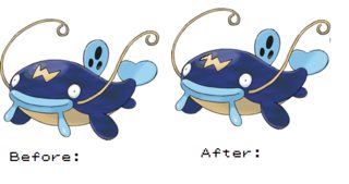
File: Whiscash Alt 2.0.png (102KB, 548x289px) Image search:
[Google]
102KB, 548x289px
>>28211793
I can see how it can allow the Pokemon to look a little more ground-like but if they were to do that I wish the didn't have to do it as a literal 'W' on the forehead of a Pokemon Who's name starts with a 'W' Even if they just added a little more to the shape to make it no longer a 'W' like pic-related but better.
>>
>>28211880
I can see where you're coming from with a little thinnger, but I think they are going for the antennas to pass as hair so I get why they are keeping them together. Almost like a Pompadour
>>
>>28211931
thing is, its name doesn't even start with a 'w' in japan
>>
>>28211962
Damn... I wonder if that means the English translators chose a name that started with a 'W' because of the 'W' on his head.
>>
>>28211958
Yeah I figured that was the case, but it just doesn't look good to me. I still love the design overall, though.
captcha pls
>>
File: Mega-Sharpedo Edit.png (632KB, 1280x1280px) Image search:
[Google]

632KB, 1280x1280px
>>
>>28212021
>didn't even see the "if there are none, click skip"
Welp, time to sudoku.
>>
>>28212021
saved
>>
>>28212023
That helps, but I just don't think there is any fixing Mega Sharpedo's design for me. Those nose-fin things are just... Whoo boy.
>>
>>28212010
maybe, the japanese name was a mythology/animal name reference rather than the whiskers
>>
File: araichu.png (45KB, 282x309px) Image search:
[Google]

45KB, 282x309px
>>28211584
Iced cinnamon roll eared Alola Raichu.
Excuse the horrible edit... I think the white goes better with the overall design.
>>
File: Scraggy cap.png (11KB, 271x248px) Image search:
[Google]

11KB, 271x248px
Not even taking anything away, but I just think having Scraggy's head fin thing be lower makes its head look more like a backwards cap, helping drive home the whole "punk kid" theme even more
>>
>>28212111
Raichu is my favorite, and I love his Alolan form so much. I'm fine with it as is but I like the way the white ears kind of round out all the white on him.
>>
File: Alola Raichu Mouth Edit.png (1006KB, 638x656px)

1006KB, 638x656px
>>28212111
That mouth is also a lot better. Pic related isn't my edit, but the same idea.
>>
File: 250px-695Heliolisk.png (35KB, 250x250px)

35KB, 250x250px
Any fix this shit
>>
>>28212142
Make it so the eyes don't stick out farther than the head.
>>
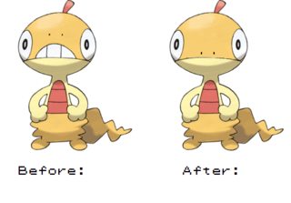
File: Scraggy Edit.png (46KB, 484x337px) Image search:
[Google]
46KB, 484x337px
>>28212120
Nice Idea. You know, I love this guy, and never really thought about it until just now, but I feel like he would look a lot better if the art that separated colors on his face was also where his mouth was.
>>
>>28212131
He's mine, too. I love his Alola form except for the ears and the placement of its mouth. I can overlook those two things, though.
>>28212139
I remember that edit. Raichu's smirk looks so much better. There's something off about Alola Raichu's smile. It's too small and close to its nose or something.
>>
File: EP677_Scraggy_asqueado_por_la_medicina_de_Iris.jpg (10KB, 342x192px)

10KB, 342x192px
>>28212256
>I feel like he would look a lot better if the art that separated colors on his face was also where his mouth was.
That's kind of how it is. His mouth is just small
>>
>>28212385
Yeah. That's adorable. Then I guess I should say I wish in game he would shut his mouth sometimes. He looks so much cuter that way.
>>
File: flat_peak_rapper_cap_back2.jpg (27KB, 500x500px)

27KB, 500x500px
>>28212385
Plus the way the mouth is helps look like the adjustable opening of a cap, which I feel like was probably intentional
>>
>>28211721
I was confused at what you were going for, until I saw the blue arms and realized it's supposed to be sonic. The blue arms are probably his most iconic feature.
>>
File: sharpedo.png (567KB, 1280x1280px) Image search:
[Google]

567KB, 1280x1280px
>>
File: Simplified Mega Sharpedo.png (308KB, 1000x1100px) Image search:
[Google]

308KB, 1000x1100px
>>28212023
>>
File: Simplified Mega Pinsir.png (1MB, 2323x1736px) Image search:
[Google]

1MB, 2323x1736px
>>28213553
>>
File: Simplified Mega Garchomp.png (485KB, 1280x1280px) Image search:
[Google]

485KB, 1280x1280px
>>28213568
>>
File: Simplified Mega GAR-chomp.png (401KB, 1280x1280px) Image search:
[Google]

401KB, 1280x1280px
>>28213588
bonus
>>
>>28213601
Man that would be GOAT
>>
>>28211743
I think the dick fur makes it look like those legs are its actual body rather than it now looking like it's wearing wide flared pants.
>>28211962
Thing is also Japanese people don't use roman letters so it seems even less likely this was ever supposed to resemble a letter.
>>28212197
It's a lizard, they have eyes that stick out.
>>
>>28213687
>Japanese people don't use roman letters
English is everywhere in Japan and out of all roman characters "w" is probably among the most frequent. Have you ever seen a niconicodouga stream?
>>
>>28213553
Why would you remove the one scar pattern on the nose that base Sharpedo actually has already?
>>
File: Roserade Edit.jpg (245KB, 970x640px) Image search:
[Google]

245KB, 970x640px
>>
File: image.jpg (16KB, 638x246px)
16KB, 638x246px
>>28211639
>>
>>28213588
God, much, MUCH better. These fucking spikes aren't necessary. The nose mark is needed anyways.
>>
>>28211584
>Hating on Wily Machines
For shame, OP. That W has always been the best part of it.
>>
File: 1472077062643.png (198KB, 561x520px) Image search:
[Google]

198KB, 561x520px
>>28211743
I had someone always give me shit for liking reshiram because it fur between it's legs looks like a penis, and blaziken is his favorite pokemon.
I wanted to slap some sense into him.
>>
File: emboar.png (997KB, 2168x1000px) Image search:
[Google]

997KB, 2168x1000px
>>28211584
There, no more stupid squiggly line.
Too bad there's no really saving a shit concept.
>>
File: AAAAAAAAAAAAAAAAAA.png (160KB, 431x431px)

160KB, 431x431px
>>28215326
Brace yourself.
>>
>>28211690
Then you're missing the point. Y is more of a logical progression of the line. From one horn (Charmeleon) to two (Charizard), then finally to three (Megazard Y).
I WOULZ, however, like to see more Megas (namely the Kanto starters) with more similar eyes to their standard forms.
>>
>>28211703
How to explain this.
It's like how minus 8 makes most of the dicks black to add color variety to the viewer.
>>
>>28213601
Trash
>>
>>28215496
Doesn't change the fact that Y looks like the most unnatural of the two.
Especially with the arm wings and aerodynamic body that doesn't increase speed.
>>
>>28213962
Now the design is too busy. Instead of editing in Roselia's roses, make them similar to the rose on top of Roserade's head.
>>
File: 250px-464Rhyperior.png (173KB, 930x776px) Image search:
[Google]

173KB, 930x776px
>>
>>28215496
Megas aren't supposed to be regular evolutions, though, they're supposed to be weaponizations of existing forms. Y looks weaker than regular Charizard. It's a failure as a Mega.
>>
>>28213588
Simplified regular Garchomp when? That's much more needed than simplified Mega Chomp tbqh.
>>
File: Machamp.png (68KB, 634x428px)

68KB, 634x428px
>>
>>28215626
It doesn't look WEAKER, it looks more AERODYNAMIC, as its Flying-type becomes more central to the design.
Megas aren't regular evolutions, but the same design principle holds with other Megas, such as Megagross. Beldum fuse to form Metang, Metang fuse to form Metagross, then Metagross fuses with a Metang in the design of Mega Metagross. Following a logical progression doesn't mean it's an actual evolution, it means it's a well thought out Mega.
>>
>>28213423
>>28213588
These are fucking excellent.
>>
>>28215998
>It doesn't look WEAKER, it looks more AERODYNAMIC
While you do have a point there its not represented in the stats also it loses points in defence so it is technically weaker.
Also the rest of your post doesn't really adhere to Y zard given the previous explanation.
>>
>>28215998
>Following a logical progression doesn't mean it's an actual evolution, it means it's a well thought out Mega.
Define "logical progression" because the intensity of Charizard's flames has always been a big part of the pokemon. It would also be a logical progression for the body to adapt to that intensity and provide extra defence as well as an all around attack boost. Sound familiar?
>>
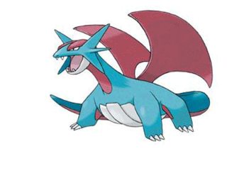
File: salamence frog.gif (106KB, 345x278px) Image search:
[Google]
106KB, 345x278px
>>
File: Simplified Garchomp.png (400KB, 1000x1047px)

400KB, 1000x1047px
>>28215653
beep boop that will be $1.50
>>
>>28211584
The W is there for a reason. It's a sesimograph.
>>
>>28211686
It suposed to look like Morgenstern.
>>
>>28216335
>>28213588
These look fucking awful. They're bland and featureless.
This whole thread reminds me why I'm glad /vp/ isn't in charge of designing Pokemon.
>>
>>28211612
You mean his nose?
>>
File: 1301354541308.jpg (66KB, 486x485px) Image search:
[Google]

66KB, 486x485px
>>28216548
It might be bait, but if you dont know this witty meme you should get out.
>>
>>28211686
Make it a bit thinner.
>>
>>28213588
>>28216335
That's fuckin' sexy.
>>
>>28213962
I still don't like its design, but your changes certainly made it better.
>>
>>28215326
1000000X better
I don't understand why the blue stripe is there, but it ruins the gaping mouth illusion that this version has and replaces it with a can't unsee fucking retarded blue "mouth" that ruins the design every time I look at it
>>
>>28211721
You forgot to make one eye blue.
>>
>>28215398
Emboar is cool as it is. Your edit is shit.
>>
>>28212023
>>28213423
I stand corrected. It has been salvaged. Nice.
>>
>>28215974
I am not artistically inclined, but could someone edit Machamp to have Machoke's toes and stretch marks? And maybe put his back arms a little lower, so it doesn't look like they're coming out of his neck.
>>
>>28211743
i have honestly never noticed the dick fur until you said something. and now i will know this forever
>>
>>28213588
>>28213601
I would actually like garchomp if he looked like this. Maybe with a little extra details, but fuck me if that isn't sexy
>>
>>28213962
So good
>>28216565
If you think that's a nose then this bitch has noses all over his hands.
>>
>>28215557
>those wings and feet
YES. Hydreigon feels unfinished for some reason, like GF was etra incompetent that day
>>
File: mega pinsir re edit.png (2MB, 2323x1736px)

2MB, 2323x1736px
>>28213568
Although that helps it a lot I still don't like the eyes. I added a bit and think I can finally consider it 'okay' if it looked like this.
>>
File: 214Heracross.png (2MB, 2884x1280px) Image search:
[Google]
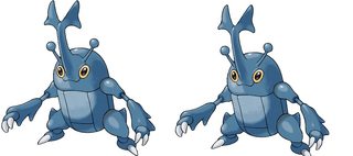
2MB, 2884x1280px
He's design is pretty much flawless, but if I had to change things it would be a few small things. I also considered getting rid of the thigh spikes.
>>
>>28211743
>not liking the cock's cock
>>
>>28211584
>let's attempt to be civil
wtf have you done to my Whiscash, kill yourself and bring your famility along with you pathetic sack of shit
>>
>>28217099
I'm pleasantly surprised it took this long for this to happen.
>>
I don't claim this is an improvement but I've never been a fan of twin blades evolving into a sharp club with a uselss hilt. I'd prefer it if Aegislash's hilt retained a similar shape as it's prevos
>>
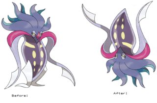
File: Malamar Re Edit.png (435KB, 1078x709px) Image search:
[Google]
435KB, 1078x709px
>>28216975
I personally really don't like Malamar but I would genuinely like it if it was flipped and it's beak wasn't visible.
>>
File: Screenshot_2016-09-02-09-15-41.png (438KB, 1080x1920px)

438KB, 1080x1920px
>>28211584
Recolored Alolan Raichu cause I never liked it's new brown color
Sorry for the shit edit, had to do it manually cause I did it on my phone
>>
>>28217291
Now it looks sad
>>
>>28215582
All better.
>>
>>28217388
Yeah, I wanted to fix the eyes but I couldn't do that effectively with my shitty abilities.
>>
>>28211612
>extra hole between the eyes
it's a window. The sand castle is basically a costume that the actual Pokémon wears.
>>
File: Alternate Aegislash.png (314KB, 1288x413px) Image search:
[Google]
314KB, 1288x413px
>>28217280
Man there really isn't high res art for Aegislash anywhere. I did what I could with a mouse to show my own idea of how it should go.
Left is when attacking, centre is offensive stance, right is defensive stance.
>>
>>28217291
The beak really needs to be there, and the body looks empty without the foot flippers.
>>
>>28217656
> dat attack forme
lol
The grip does look much better.
>>
>>28217656
Now it doesn't look like a haunted sword, but a haunted scabbard that carries a sword.
>>
File: 343cc40b0692e9ad437260506f18740b.jpg (110KB, 640x360px)

110KB, 640x360px
>>28217438
Yeah... I know that the holes represent windows, but visually it would be less awkward without the third 'window' in between the eyes. The eyes are windows too.
>>
>>28217691
Well I flipped it so that the body is it's head, more like an actual squid, and therefore the beak would be found in the tentacle area.
>>
>>28217961
Why? It's a castle. No point in spacing windows so far apart,
>>
>>28216092
No. Having a visual cue of 1, 2, 3 is a much simpler logical progression than "it needs to adapt its body for the intensity of its flames."
>>
>>28217998
Because it's Not a castle. It's a Pokemon. Hell it's not even a Pokemon based off a castle. It's a Pokemon based off a sandcastle. You don't need blueprint level specifications on a Pokemon design. The 2 eyes having a spot in the middle just as big and spaced apart as the eyes makes the eyes much less pronounced and it looks better as a face based off a sand castle without it to me.
>>
And some people genuinely think 'pokemon nowadays tend to be overdesigned' is just a mene
>>
>>28217979
I understood what you were going for, but then the "face" area looks too empty. And I doubt it'd be expressive enough, particularly considering how much Ramalam emotes.
>>
>>28218134
They've gotten better, but things got really retarded during Gen 4.
>>
>>28218152
Yeah, I can see your point. I just never liked the upside down squid design. My biggest complaint about it is those tiny foot flippers. The guy looks stationary. I cannot see him walking on those.
>>
>>28217069
I CAN'T SEE!
(the difference)
>>
>>28215326
fuuuck this is great
>>
>>28218234
Look at the head.
>>
File: tumblr_m15x13XZmy1r35ucbo1_500.jpg (134KB, 500x281px)

134KB, 500x281px
>>28216892
Anyone? Please?
>>
>>28216892
>>28218498
Machoke's head and skin colour look cooler too.
Hell, Machoke just looks cooler than Machamp all around.
>>
Literally my mom`s fox
>>
>>28212139
I support this mouth change you"be brought us here, looks much better
>>
>>28218587
My mom's fox doesn't have nine tails that are all as big as then rest of its body, nor is my mom's fox like waist high, it also doesn't breathe fucking fire so
Oh wait that makes me le jenvunner
>>
>>28211584
>likable edits
>removing the W
Fuck off retard
>>
File: gengarfixed.png (486KB, 1280x1280px) Image search:
[Google]

486KB, 1280x1280px
White eyes > red eyes
>>
>>28215557
>too busy
Shut the fuck up. It's only one part of its body that's made to stand out. If it's not too busy on Roselia it isn't here.
>>
File: gengarfixed2.png (300KB, 640x640px) Image search:
[Google]

300KB, 640x640px
>>28218671
Just in case I went to far with the dark color. My point is mostly about eye color.
>>
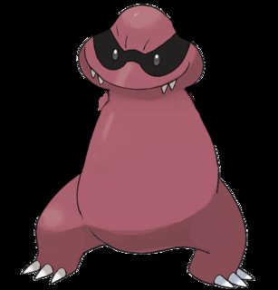
File: 1407883730070.png (158KB, 600x625px) Image search:
[Google]
158KB, 600x625px
I removed all the parts that I felt were excessive.
>>
>>28218721
I like the darker one more.
>>28218731
Old.
>>
>>28218693
Post an image of roselia right now.
>>
>>28211584
>getting rid of the wario w
Keep your filthy fucking hands off my bro.
>>
>>28218693
Roselia had two roses total; in this redesign, Roserade has six.
>>
>>28218498
*notices bulge*
owo
what's this?
>>
File: Capture.png (462KB, 1107x682px) Image search:
[Google]

462KB, 1107x682px
I'm sorry as much as I fucking love these guys, I couldn't stand their shitty eye-colors, especially with the female since the designers thought it would be a great idea to use a Mcdonald palette for hers.
>>
>>28217291
love it
>>
>>28219775
preddy gud
>>
>>28215582
There was a thread with alt drawing for rhydon's evolution.
They were all way better than that weird orange thing
>>
>>28216335
I would have kept the spikes on the arms, but yeah. the yellow splotches were entirely unnecessary.
>>
File: rhyperior fixed.png (186KB, 756x300px) Image search:
[Google]
186KB, 756x300px
>>
File: dusclops new.png (1KB, 65x65px)

1KB, 65x65px
I can only do sprite edits, but I think Dusclops looks better if its eye was glowing from within, like Duskul, instead of a big bulbous cartoon eye glued to the front of its face.
>>
>>28219775
I like it. The female's eyes bother me too
>>28220852
Massive improvement.
>>
>>28220852
You fixed Rhydon. Now fix Rhyperior.
>>
>>28215398
shit edit. the gold is like a championship belt, plus it's complimented by the gold trimming on its arms and legs
>>
>>28215326
what was that blue supposed to be, anyway?
>>
>>28218721
Nah, I liked the darker version
>>
Hey, i fixed unown
>>
>>28218671
>>28218721
Ive always been an Haunterfag but for some reason this makes me like Gengar a lot more. Perhaps because I see more of Haunter in him this way.
>>
>>28221517
Nice
>>
File: Rhyperior Color Edit.jpg (17KB, 250x250px)

17KB, 250x250px
>>28220852
Eh.
>>
>>28213588
>removing the zipper spikes
It's shit
>>
>>28212090
Funny thing is, like how we wanted the extra line on the w, its jp translated name starts with an n, and a w is a line and an n
>>
File: 068Machamp.jpg (401KB, 1058x1058px)

401KB, 1058x1058px
This is what i think Mega-Machamp would look like.
Thread posts: 153
Thread images: 54
Thread images: 54
